
In our previous Maker Series post, we claimed that the future of photography isn’t just about the screen – and we still assert that to differentiate yourself, you need to go well beyond Instagram likes and clicks. It’s coming back full circle to being about MAKING ACTUAL THINGS with your work – and that includes putting it on paper.
When it comes to printing, you can quickly become overwhelmed by the sheer number of printers, papers, and preparation necessary to get something off the screen and onto the page.
I like simple solutions, and after having used numerous printers, I’ve again settled on Artifact Uprising for both the simplicity of their product and the unbelievable quality you get for the price.
In this installment, I’m going to walk you through my processing workflow (which is simple), and the choice of paper (which is simple), as I prep to print.
Grab a cup of coffee (or beer), and let’s get started!
How I Prep My Images
When working in Lightroom (or Photoshop) I try to keep any things simple – especially when it’s a film scan. There is typically already a lot going on once an image gets digitized. Things like tone, mix, and grain have all conspired to bring me a shot that has most of the personality I need, so the idea is to enhance where needed – especially in preparation for printing.
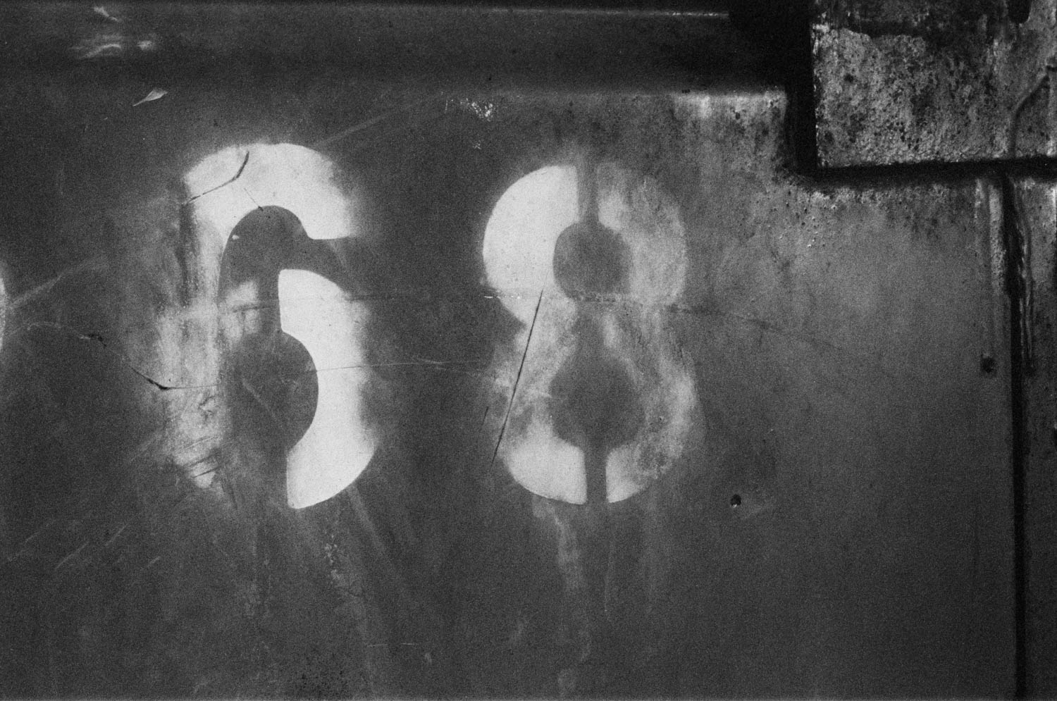
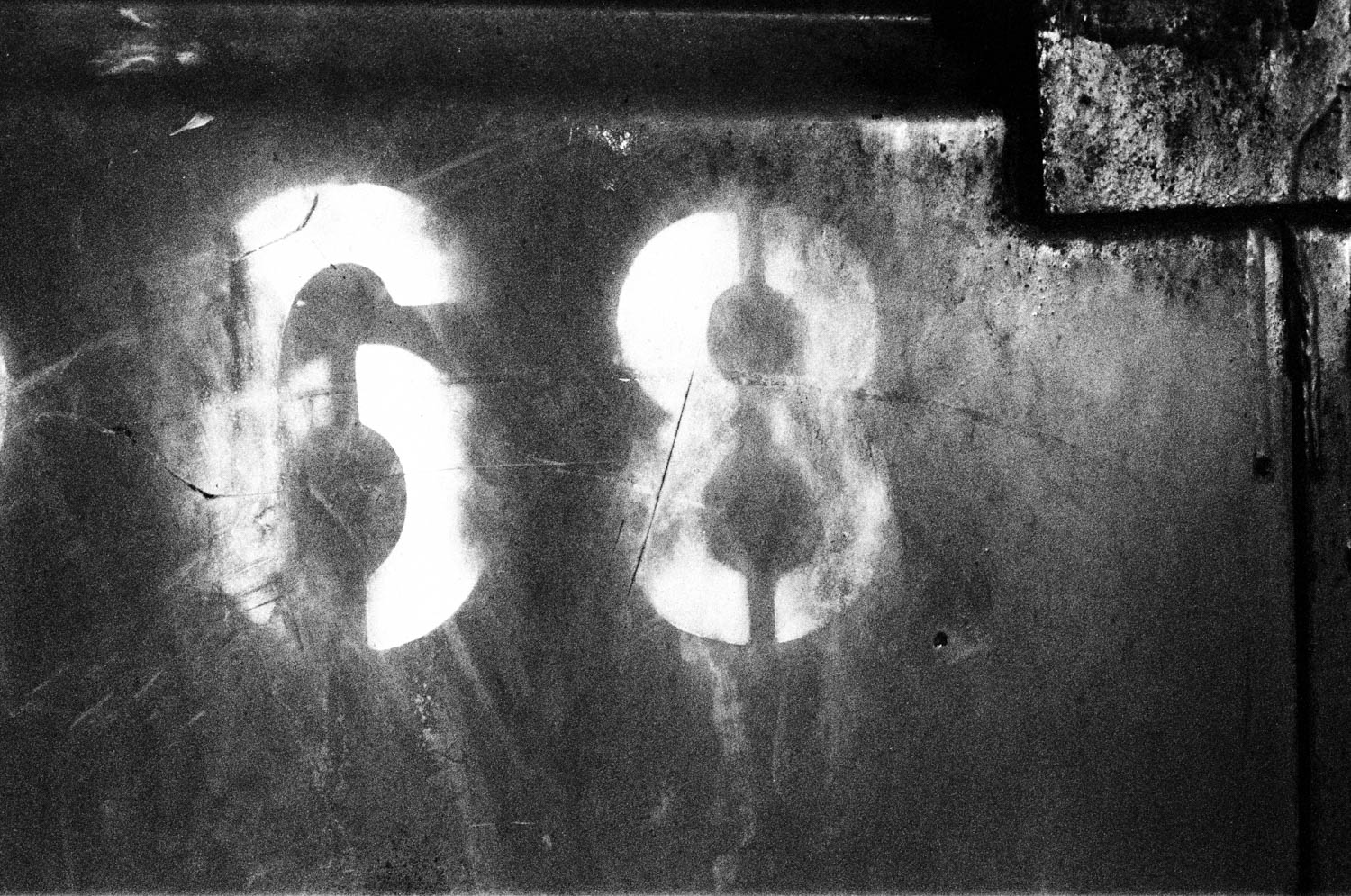
The image I am working with for this print was shot on Kodak Tri-X 400 Black and White film, which I tweaked ever so slightly with some Ilford SFX 200 Mix and Tone from the XEQUALS Platform.
Here’s a before/after so you can see the subtle adjustments the Ilford SFX 200 uses to punch up the blacks and whites while tightening the contrast.
Setting Your Black and White Point For Printing
A critical exercise in preparation for printing on any device is to find (or create) your black and white clipping points for the image. In Lightroom this is super easy. Within the Develop Module just press the J key and you’ll toggle on the Clipping Indicators for your image.

There is no right or wrong way to set these clipping points (if at all). But keep these things in mind when you do – especially when it comes to printing.
- The red outlines where your image is blowing out to pure white
- The blue outlines where your image is pulled down to pure black
- Pure white will represent itself in the tone of the paper you will use, so it’s not really pure white you’re getting in your print – this is why paper choice is so critical.
- Pure black will represent itself as a full wash of ink on your print – so much so that depending on your printer and how dark you pull it, you may get blotting or bleed on the print.
- How much you blow out or pull down your clipping points is part style and part technical capabilities of you printer – so experimentation is key.
As you can see below, I tend to get aggressive because I know Artifact Uprising’s printer can handle it, and the paper tone works well at the pure white (non-ink) portions of the print.

And that’s it. Remember, keep things simple.
Off To Artifact Uprising
Disclaimer: I am in no way affiliated with these folks, they just do great work!
I’ve settled on Artifact Uprising’s Ultra-Thick Signature Prints for my work, and have seen many others doing the same. The Ultra thick Mohawk Superfine Eggshell 68pt paper is like nothing I have ever seen before. Paper choice is what gives a print it’s tactile personality, and Mohawk is leading the market here. This is the same company that manufactures the Mohawk Superfine paper, to create Moo’s thick 32pt Luxe card stock. This stuff is top notch all around.
You can learn more about their papers, and printing approach on their site.
Loading your image into their editor is easy and intuitive, and you get a real-time view of your print margins and placement directly in the tool. Simply load up your image, drop it in, and order.
The Final Print
One thing Artifact Uprising gets right … is presentation.
From the minute you open their packaging it’s clear someone took the time to make sure your work was treated with care and respect. From the fold of the paper to the placement and taping of the welcome card, it’s clear these folks have a heightened level of care that you don’t often find from other printers.

The welcome card itself is beautifully designed and crisp in its message.

Here we can see the attention to the corners, cut, and ink coverage. The whites are white (thanks to the Mohawk paper) and the blacks are spot on without any visible blotting or bleed.

I’m beyond happy with this product, and it represents my vision exactly as I had seen it. Whether you choose these folks or not for your next project, the key takeaway is to work with someone who understands, respects, and works with exacting standards because your work, and your customers, deserve it.
This Is Only The Beginning … Make This Your Business
For those of you making the leap to selling your work or your services, think about how easy it would be to turn this into a product that you offer your clients. The all in hard costs for this product are approximately $30.00 including shipping.
And remember, these are just the single print products they offer. There are dozens of other print products you can leverage to drive a unique solution for your clients – from books to square prints and all things in between.
There’s an occasion every day worth celebrating, and the permanence these projects brings will deliver memories for your customers for years to come. Remember you’re not selling your work, you’re selling an experience—an experience that comes with amazing products like this!
Give Back To Others In Your Community
Using your unique voice, creativity, and style to tell your story and inspire others is what XEQUALS is all about.
We want you to take a moment to think about your passion, your creative spark, your inner light that drives you to create, and pair that with the unique perspective that already exists within you. You already have what it takes to be great.


