Anyone who knows me knows I am a huge fan of Richard Avedon. His genius lies not only in his composition and storytelling, but also his use of deep blacks and bright whites in his shots – punching on both extremes until they are boiling over!
While working on a recent project, I wanted to take advantage of his tonal approach along with some additional goals:
- Work exclusively in Lightroom
- Standardize an approach that would work for all images in my series
- Create a reusable object (ie. Lightroom Preset)
- Share this preset with others
We’ll start with the final image:

The high ISO has introduced some noise that really gives this image character, so we’ll keep it in there.
Now let’s look at the process of development:
Here is a quick before and after shot in Lightroom. Notice the histogram shows that this image pulls to the left substantially. I’ve lost a lot of highlight information in the original, but that’s ok at this point. In the next steps we’ll push the highlights over and stretch the mid tones a bit to get the correct tonality for our desired ‘Avedonian’ effect.
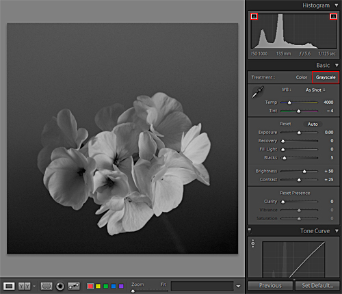
Let’s start with our BW conversion in the Develop Module and set the clipping notifications for the image as well. I absolutely love these clipping points because they tell me precisely where and how much I am pushing my whites and blacks around – with razor sharp precision.
Our steps are as follows:
- clink on the black and white points to turn the clipping indicators ‘on’
- select ‘Grayscale’ to drop the color out of the image
Notice when doing this we see that there are no pure whites or blacks in the image based not only by the lack of indicators showing but also by virtue of the histogram as well. We’re in a good position now to start punching the tones around.
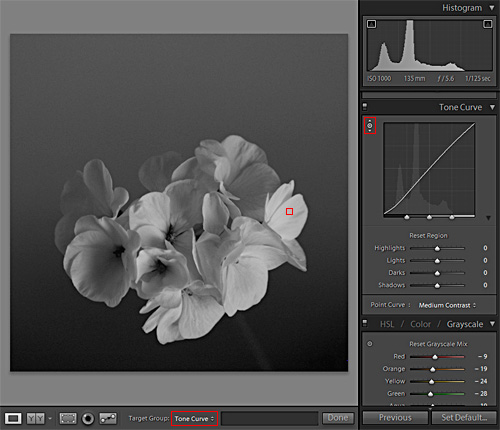
Lightroom allows you to work in what is called ‘target mode’ (or what I often refer to as ‘direct edit’). It is in this mode that we will make our adjustments.
- select the target mode tool in the Tone Curve panel
- under Target Group in the lower image window select ‘Tone Curve’
- click and hold your mouse on any area that defines your brightest tone in your image and drag the mouse to the right to punch your light tones closer to white, paying attention to the white clipping indicator as they blow out
Notice in the above image I did not clip my whites as seen in the highlighted area in the histogram. Although, we can see as highlighted in the tone curve and in our histogram that we have SUBSTANTIALLY pushed the whites in our image.
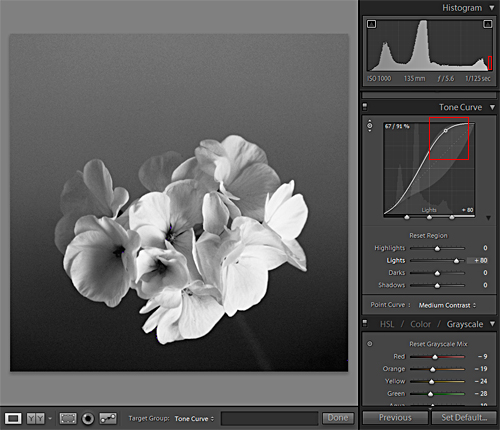
Next let’s work on the blacks:
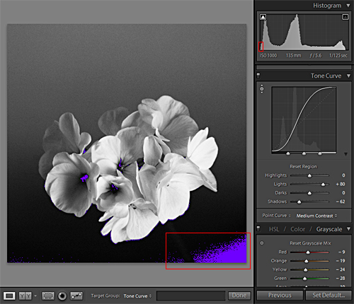
- select the target mode tool in the Tone Curve panel
- under Target Group in the lower image window select ‘Tone Curve’
- click and hold your mouse on any area that defines your darkest tone in your image and drag the mouse to the right to punch your dark tones closer to black, paying attention to the black clipping indicator as they blow out
Notice in the above image we clipped the blacks considerably as seen in the highlighted area in the histogram. Additionally, we can see as highlighted in the tone curve that we have SUBSTANTIALLY pushed the blacks in our image – Avedon would be proud!
Now let’s target the mid tones, and lighten them up a bit:
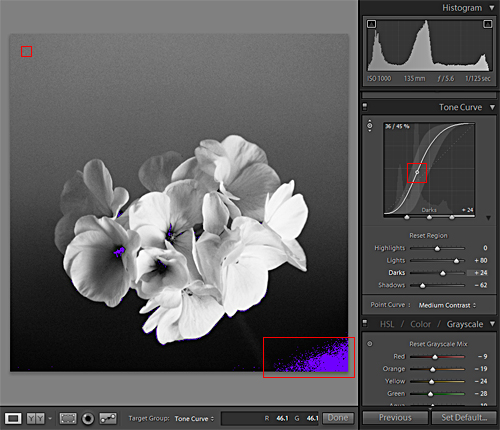
Select the target mode tool in the Tone Curve panel.
- under Target Group in the lower image window select ‘Tone Curve’
- click and hold your mouse on any area that defines the mid tones (as show in the upper left of the image) and drag the mouse to the right to massage your mid tones closer to black, paying attention to the black clipping indicator as they blow out
The histogram is not very helpful in understanding how our tonal range has changed in this particular move, so we’ll pay attention to the tone curve for those details.
In the final adjustment I want to cradle the image in pure black and I prefer to use a vignette to do so:
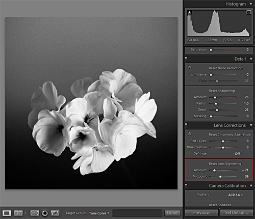
With our vignette adjustments in place we’ll use the black clipping indicator to tell us just how much black we’ve introduced into our final print:
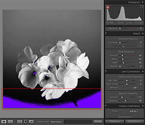
Not only do I have just the right amount of black, the posterization taking place on the edges allows the blending of the blacks to the mid tones to print very clean on final output. In this case I will be printing to a 10″ x 10″ Kodak Archival print at my images native resolution of 240DPI.
Ready to bring your images to the next level? Click below to get started.
Super Punch is available with the XEQUALS Platform.


