Now that you understand why Lightroom Mobile is awesome, it’s time we take ourselves away from our desktop monitors and venture, bravely, blinking-ly, into a new mobile territory.
Let’s pick up where we left off after downloading our downsized images to our mobile devices.
Remember: these are just downsized versions of our original shots and should not be used for advanced focus pixel peeping.
Flag And Tag (Stars) – Filtering Fast
This is where the enjoyment of initial edits begins. And it can begin from anywhere if you enabled offline editing in Lightroom Mobile.
Opening the first Collection Initial Mobile Filtering & Edits brings up a grid of images.
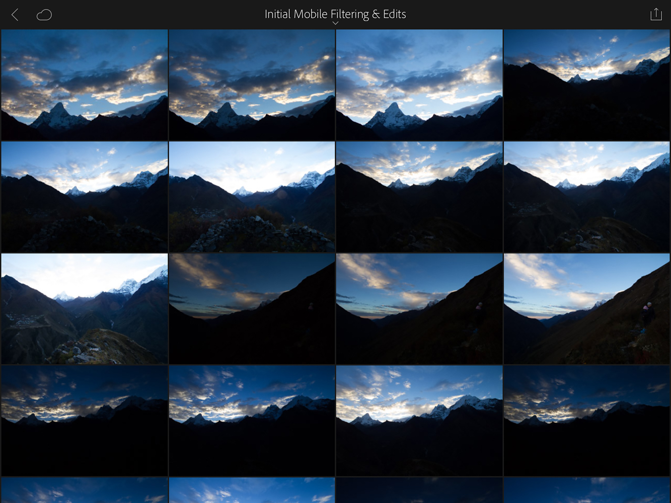
From there I tap the first image to get started.
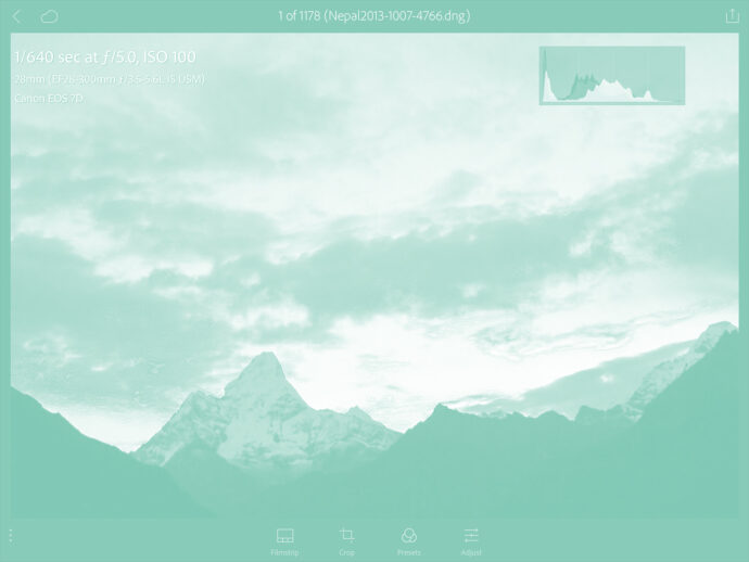
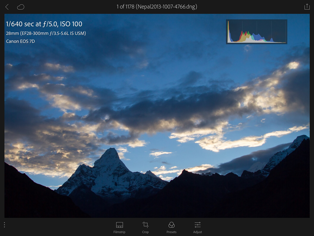
Pro Tip: Tapping the screen with two fingers in the single image mode will toggle through showing the histogram, shooting info, both or none. This is helpful later in editing.
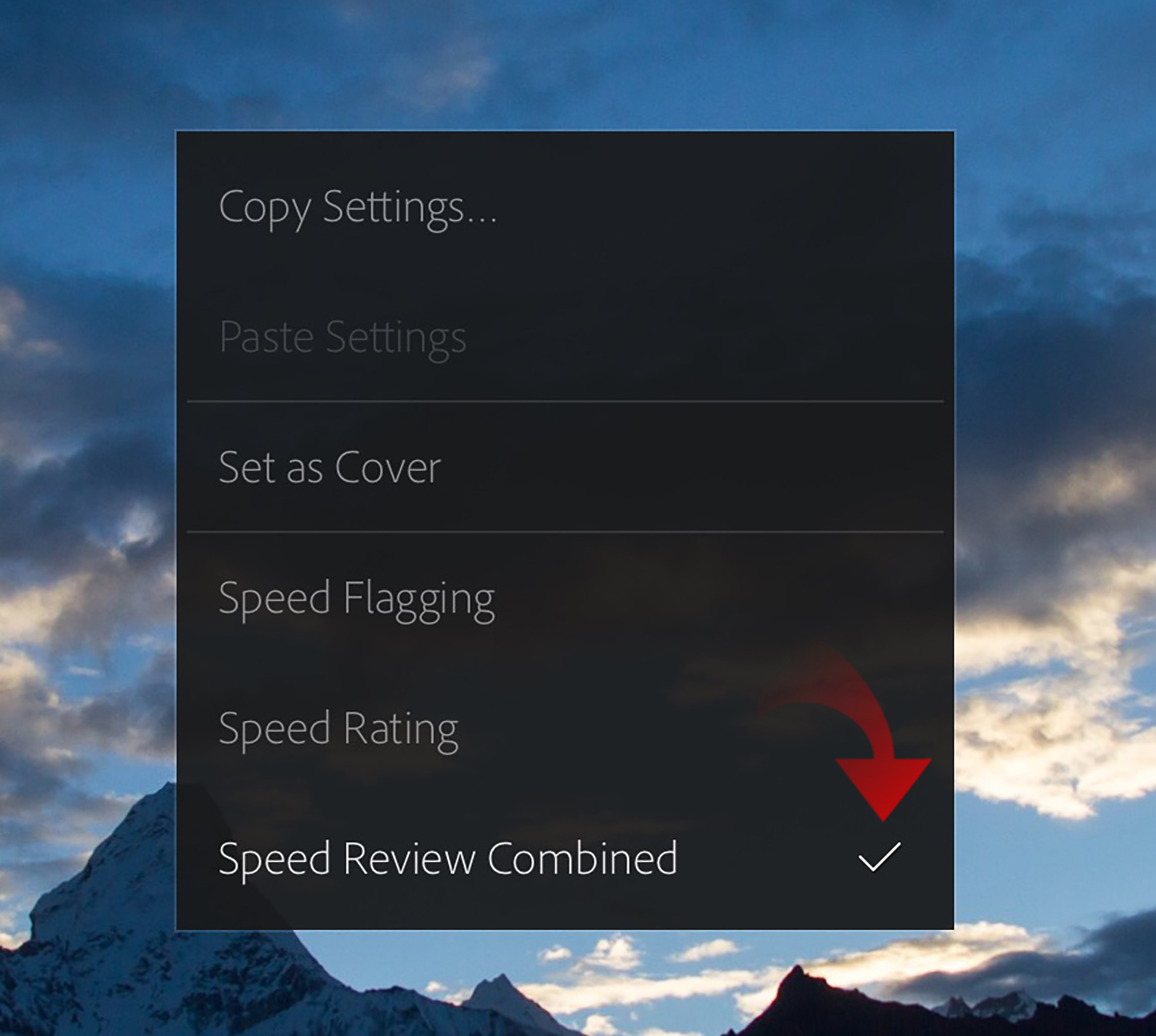
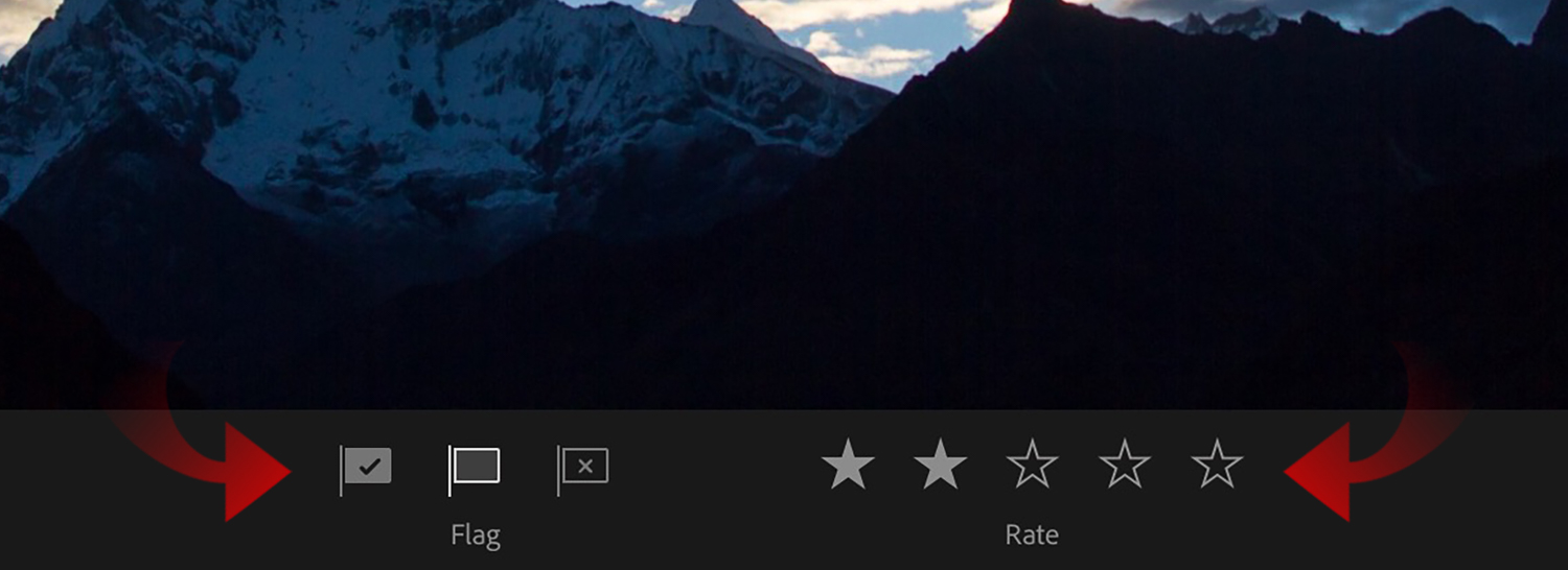
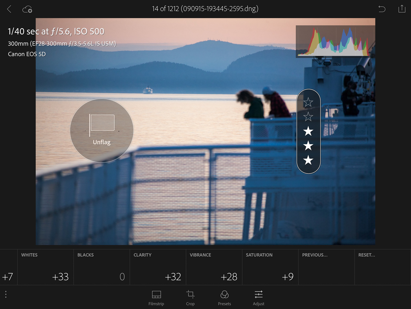
If you hold down one finger on the image, you will be presented with a menu of options. The ones we care about are at the bottom and relate to rating our images. I turn on both Speed Flagging and Speed Rate, called Speed Review Combined.
The way it works is this: think of your screen being split down the middle. The left side of the image is used for flagging, and the right is for speed rating. To flag, drag one finger on the left side up or down and you will see the Unflagged icon change to either Flagged (as in you think this is a good photo) or Rejected (a black X on the flag helps drive this home). On the right side, the higher up you drag your finger, the higher the star rating goes.
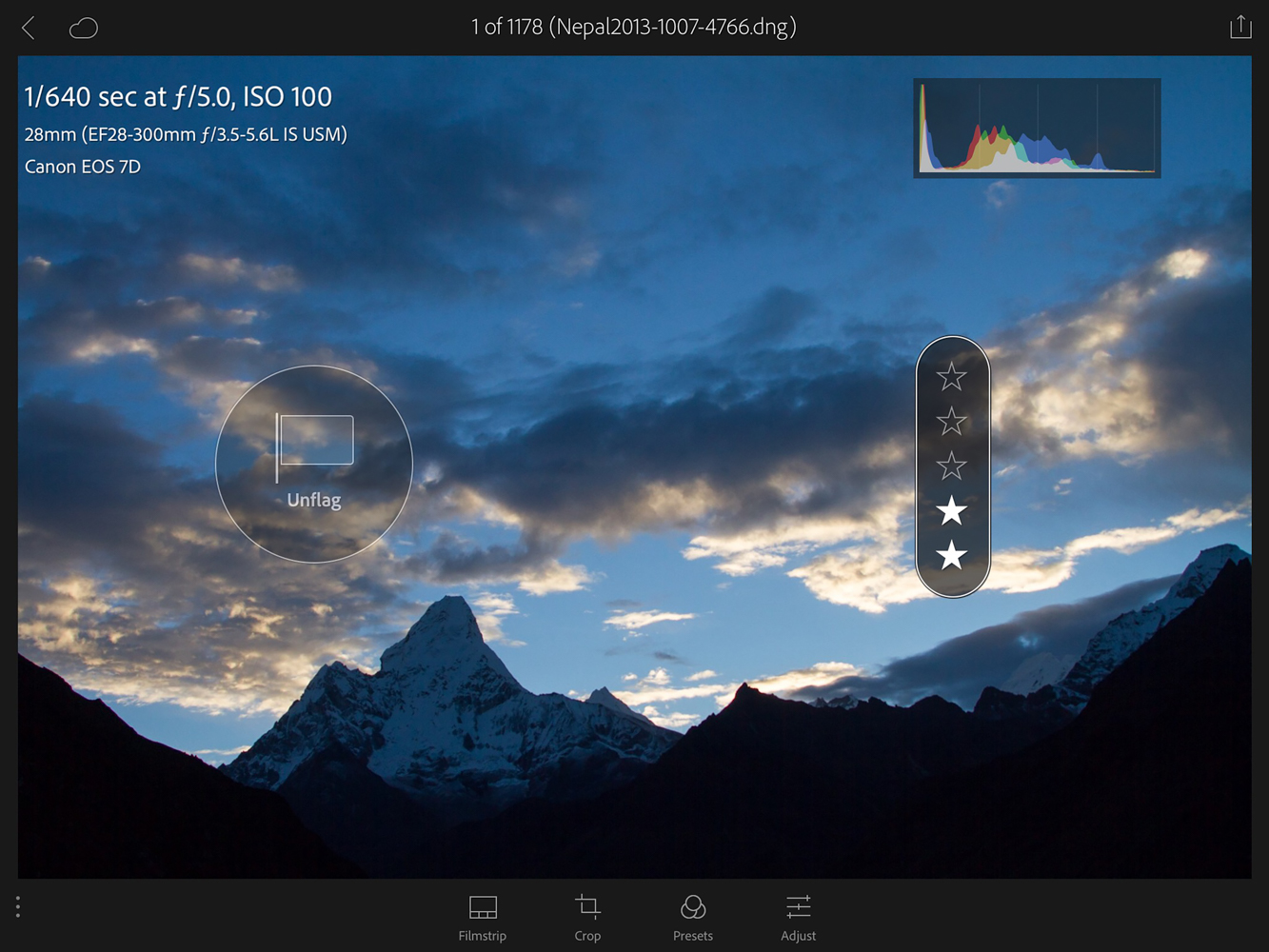
As this is my initial pass, I typically rate my items to a 2 star to let me know I like them and need to edit them later. Sometimes inspiration takes over, and I edit the photo to what I call, “mobile completion” and end up giving it 3 stars. We’ll touch on how the program handles those images near the end of this post.
Did you notice those three little dots on the bottom of the image?
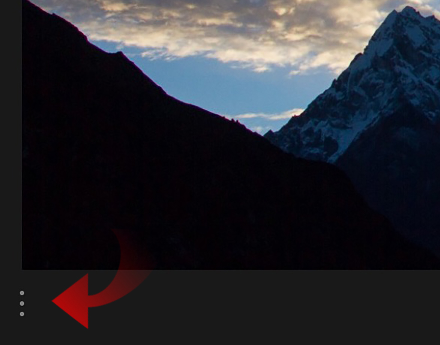
Selecting those dots brings a new menu under the image that has the same flags and star ratings we were just editing. This is another method where you can just tap on the rating or flag you want directly.
From Two Stars To Three
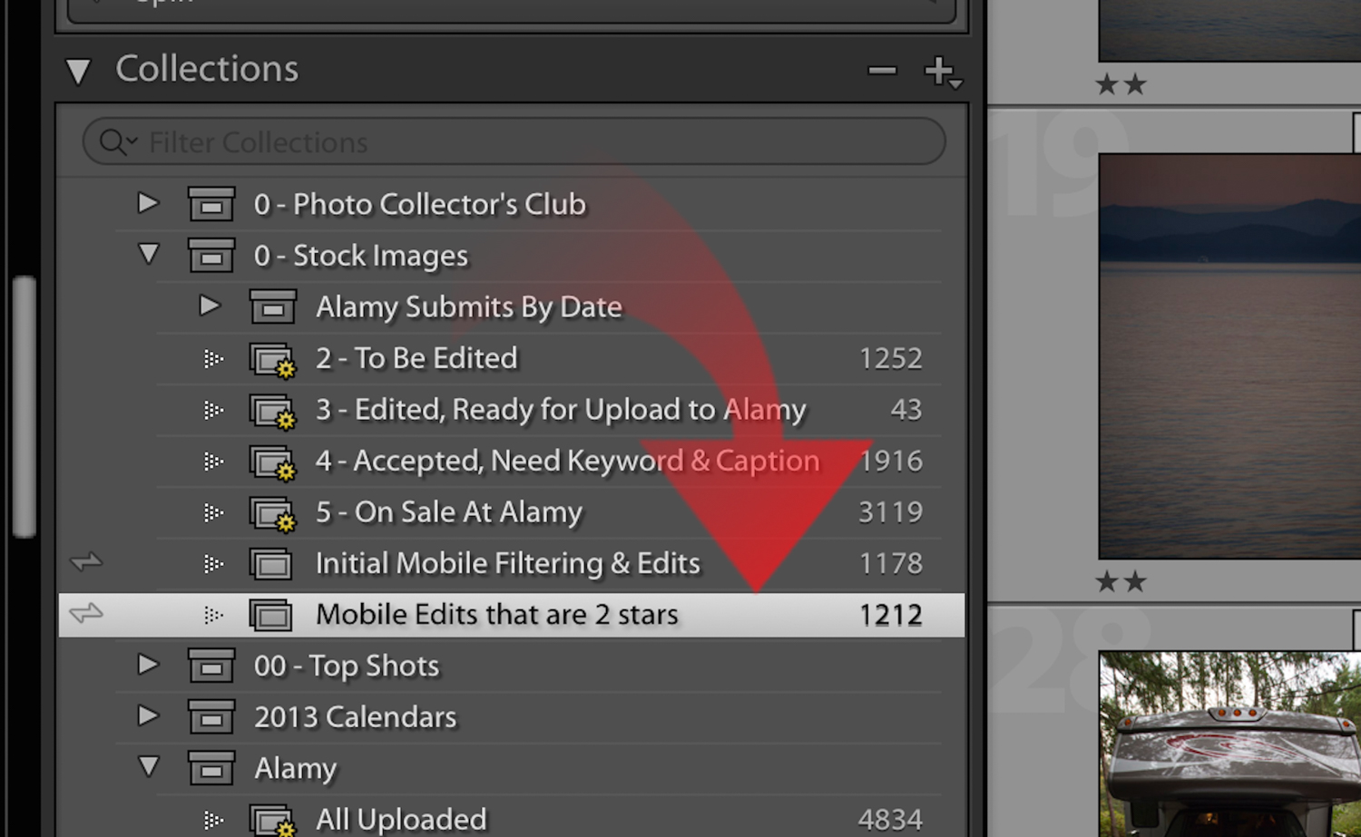
In the other sample Collection are images that have been deemed fit to edit. These images have a 2 star ratings and were placed in the “Mobile Edits that are 2 stars” Collection back on the desktop then automatically synced when online.
I have been thrilled with the deployment and development of Lightroom Mobile as a highly useful tool in decreasing the time I spend seated in front of my computer.
It’s really easy, I simply filter for any 2 star images in my entire Lightroom catalog on the desktop (more about filtering methods can be found here). Select All then drag them to the Collection.
Basic Adjustments
Taking a look at this new Collection of 2 star images, I have a whole host of pictures to tackle.
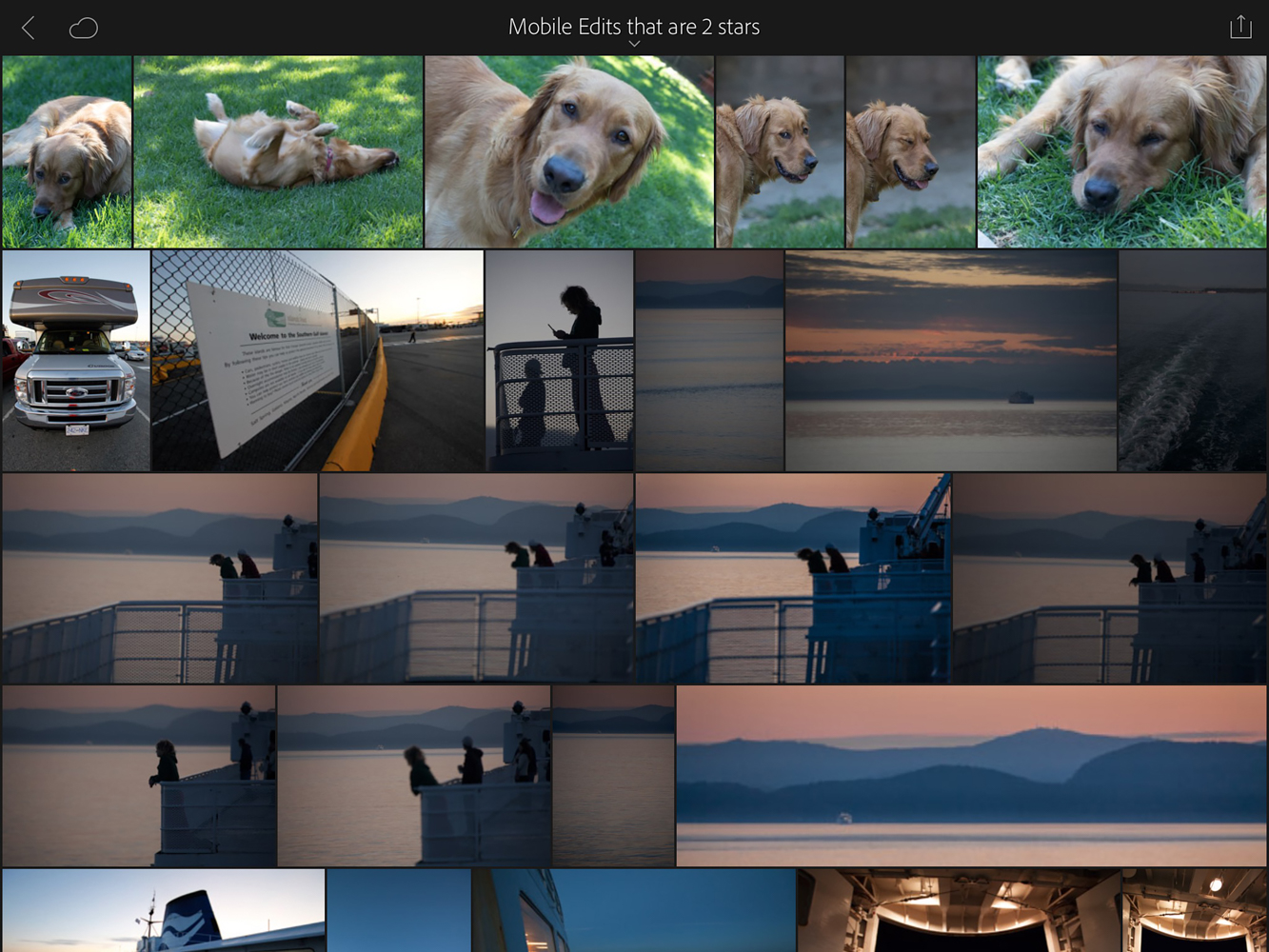
I’m looking to do basic edits to these images and nothing fancy. As easy and efficient as Lightroom Mobile is, there are some things it cannot do:
- Spot removal
- Gradient Filters
- Tone Curves
- Individual Color Correction
And more. Those edits will have to wait for time when I am in front of my desktop. But 80% of my work can get 80% done on the iPad. Let’s take a look.
Click Adjust on any old image…
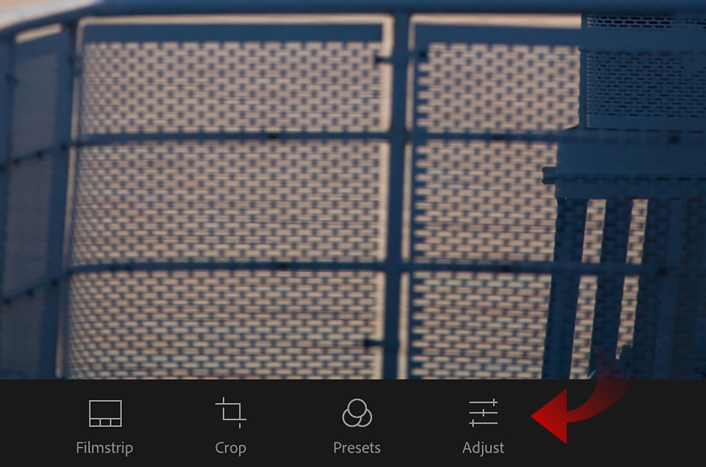
… and you will see a plethora of adjustment options appear.
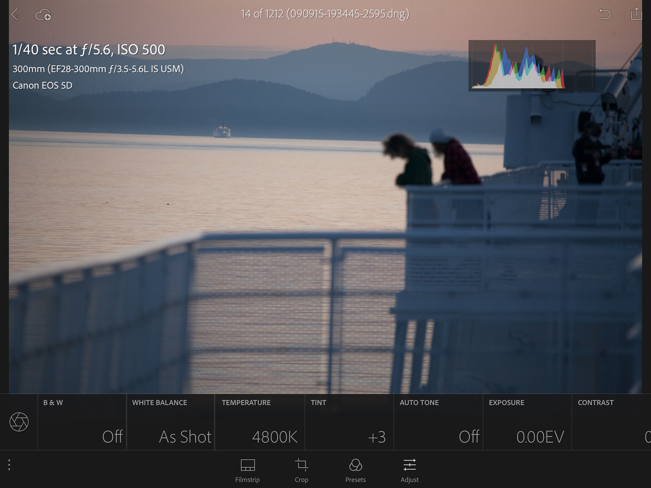
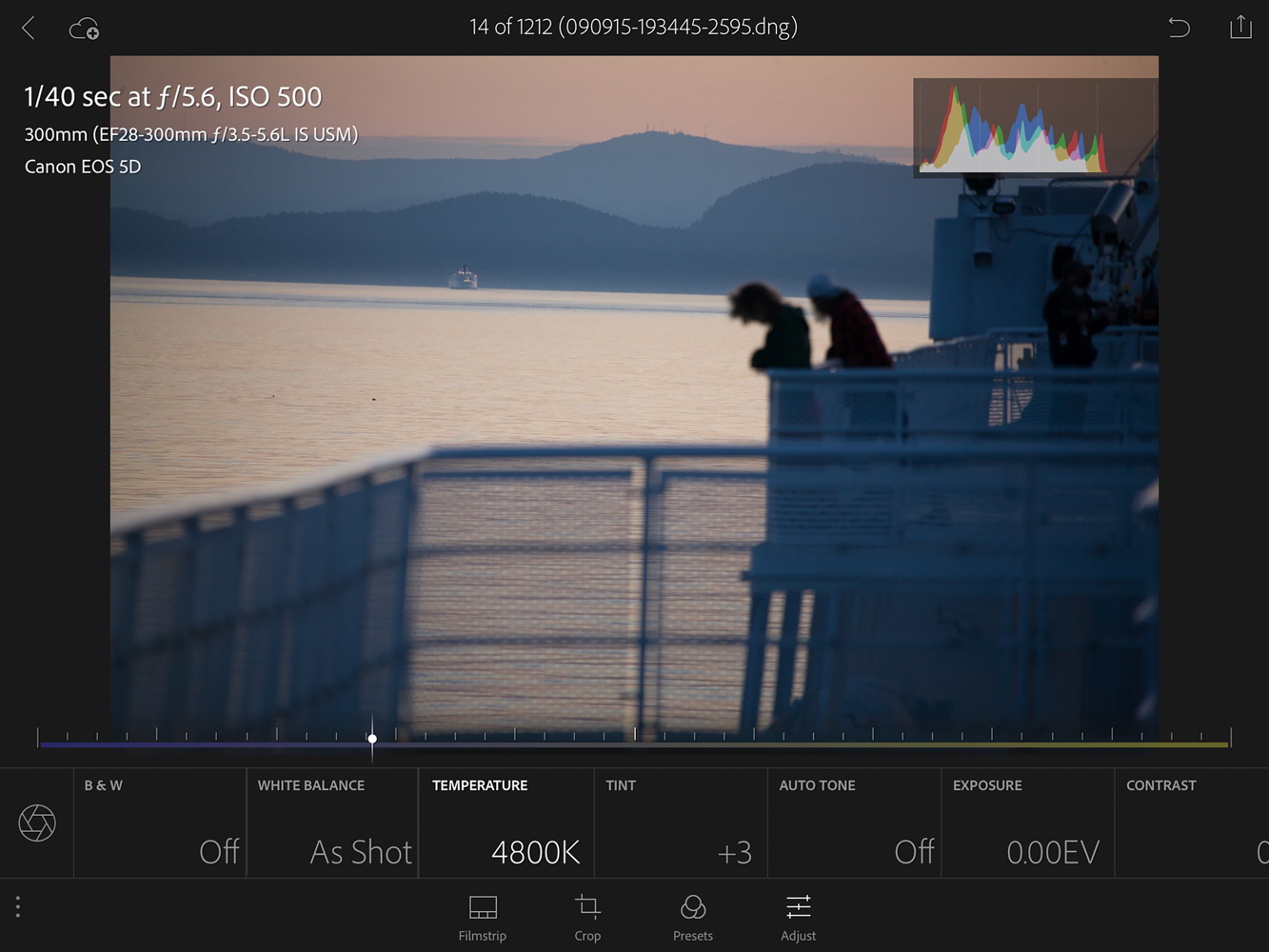
There are enough to take up two full screens.
This might frighten some people, but I have actually found the Auto Tone feature to be very helpful in getting started. It has become my friend even as the thought of using Auto-anything used to make me break out in hives and curse uncontrollably under my breath.
The other controls are the same as the desktop version of Lightroom.
Clicking on an adjustment option brings up a slider, seen here with the Exposure adjustment.
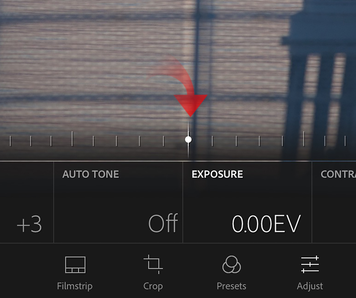
The sliders all start in the middle and can be moved in either direction for positive (to the right) adjustments or negative (to the left). Two sliders have special coloring to them. They are Temperature and Tint.

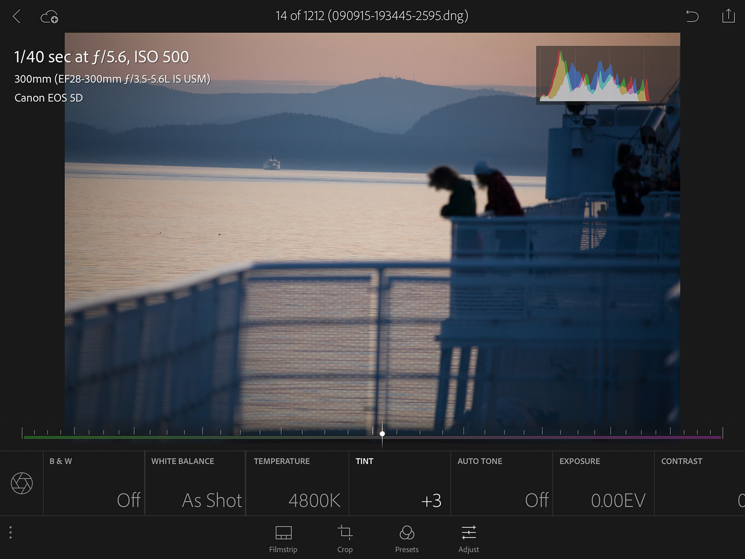
The Temperature adjustment shows what will happen if you move the slider left (more blue effect) and right (more yellow). These movements mimic how Lightroom Desktop functions. The same goes for Tint which induces more green or magenta.
These simple sliders get me to satisfaction 80% of the time and that’s a pretty good number for me.
Previous Is Your Friend
Previous is a wonderful tool in Lightroom Mobile when you have a lot of similar images. For instance,I have a number of images with similar exposures and content with these ferryboat photos.

If I select the first ferryboat image and make some edits to get it how I want, I can then simply swipe left to the next image, tap Previous and up pops some options.
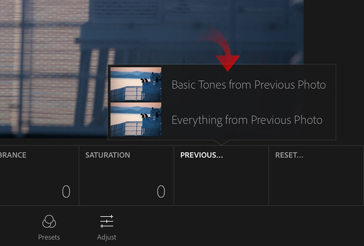
Basic Tones From Previous Image is just the basics, like Exposure, Contrast and Clarity; those sliders you see at the bottom in the previous section. Everything From Previous Photo includes things like cropping, and any presets used. You can see in the image below, all the adjustments I made previously apply to the new image and for me.
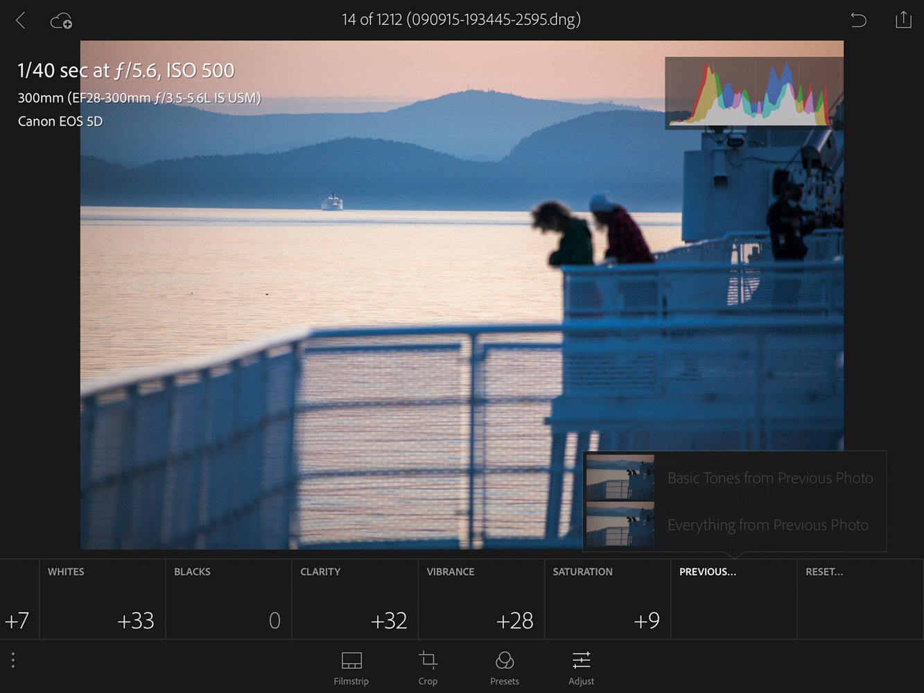
When I finish the edits, the images all get a bump up to 3 stars.
Back At The Ranch … Or Desktop … Or Whatever
As I mentioned, Lightroom Mobile gets me to 80% with 80% of my images. That 80% then needs just a few more tweaks to make sure they are ready for prime time.
My last step above was to upgrade those that were able to be edited to 3 stars. That means I can now go to my 3 star Smart Collection and see them all in one place (Any that need more help stay at 2 stars for manual edits).
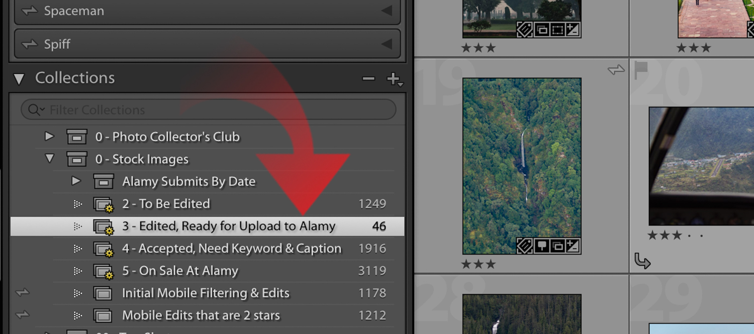
At this point, I will apply Chromatic Aberration and Lens Correction to all these three stars. I know for my camera and lens setup, this usually helps. I will further filter and see if any high ISO images (800 and over) can use some Noise Reduction and adjust those manually.
Otherwise, that’s it! I then ship these images off to Alamy, sans keywords and captions, in one batch. To keep myself sane, I have developed a small trick to know what has and hasn’t been submitted. I use the Job Identifier IPTC field to note Submit Alamy for images that have been submitted and just Alamy when they have been accepted. I can then filter my 3 star Collection and exclude for the word Alamy to see what is waiting to be uploaded.
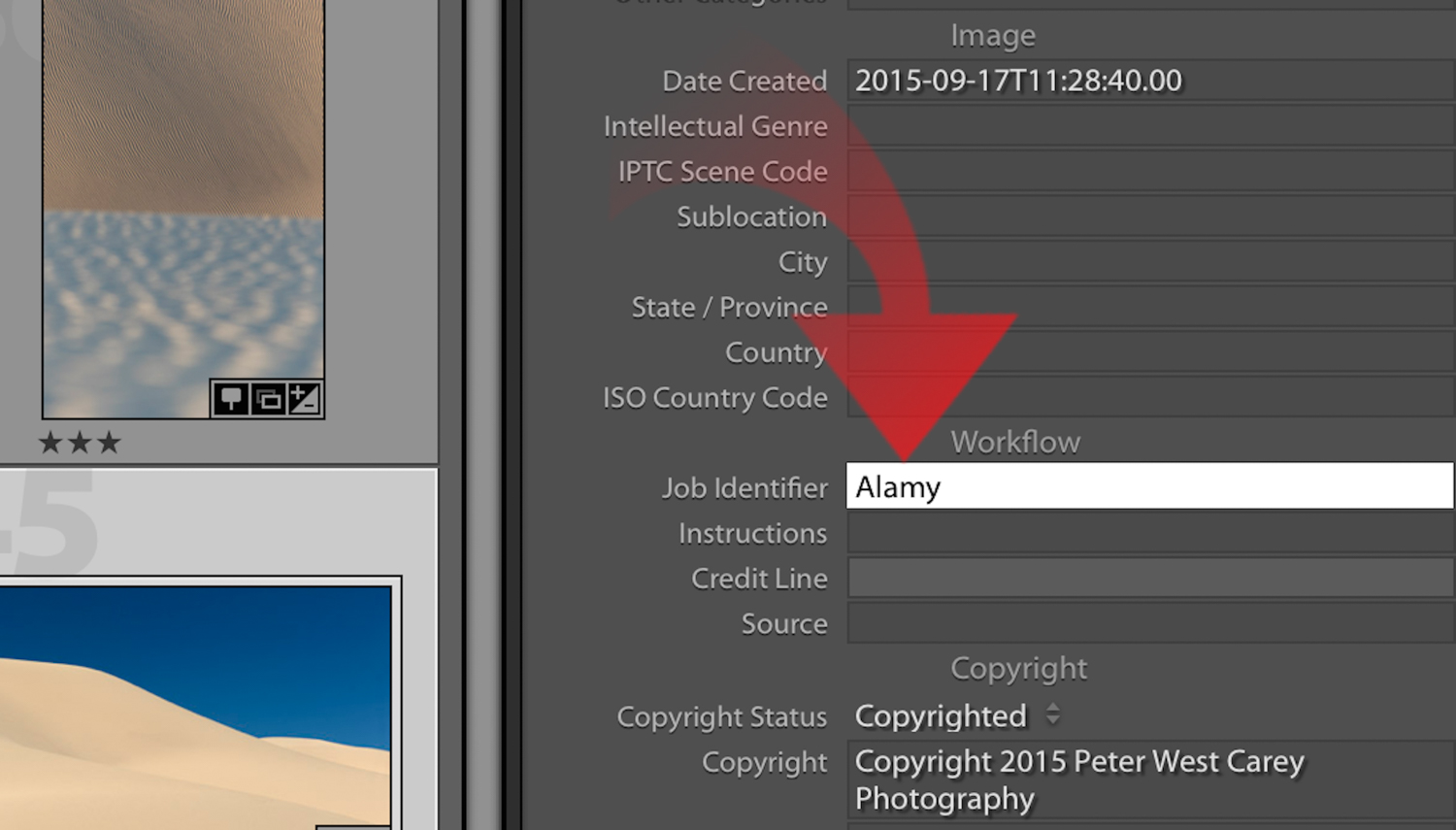
Once Alamy accepts the images, I highlight them all and hit the number 4 on the keyboard, which upgrades them in the system, moving them into the keyword and caption phase. When they have all been keyworded and captioned, I update the info on Alamy via a Lightroom plugin called Alamy Image Uploader (it is also what I use to submit images directly from Lightroom).
Then upgrade them one last time to five stars.
Done!
Sane Is A Relative Term
Are you still with me? It has taken a while to get this process down on both the desktop and mobile device. Once it’s down, you won’t believe how easy and convenient it is.
Note: You can do this on an iPhone as well as an iPad on an Android Phone.
It gives me a way to work on images in two capacities while away from my chair and desktop. I can either sort images, an often mundane and backbreaking process, and it allows me to edit 80% of my images more conveniently than at my desktop. I will get up from my desktop when I’ve had enough of that seated position and relax on the couch with my iPad to continue editing and selecting.
Not only that, but I can get some editing done during downtime away from home. Airplanes, waiting rooms, long lines at the DMV are all now chances for me to edit.
Lightroom Mobile can’t do it all for you, but studies have shown that a change in scenery will boost creativity. And, if you use the feature as I have done here, I can promise that it will help break up (and speed up) your editing workflow.
