Experimentation Is A Critical Part Of The Artists Journey
Part of keeping things fresh requires that you to navigate out of your comfort zone, try something new, and ditch what always works in exchange for a renewed approach.
What you need is a break from the norm, a subtle kick in the pants that drives you to try something completely different – to experiment and play around.
Without this, things start to look formulaic, sameness starts to permeate the work, and your growth as an artist starts to slow.
With XEQUALS Color Overlays for Lightroom, we’re pumped to bring you another important piece of the XEQUALS Platform!
We’ve taken duotones to a place where experimentation, attitude, and color all blend together in seamless harmony.
It’s time to try something new.
So What Is This All About?
Creating a color overlay in Lightroom isn’t really that hard, but it does require you to do some things that you probably didn’t know you could do – like creating a flat tone curve.
But here’s the best part, you don’t need to know how to do that to get started, because you can apply your XEQUALS Color Overlay preset first and then tweak your image from there. It’s all about getting into experimentation mode fast, and we designed this product to do just that.
Here’s our source image:

… and here are the the Basic settings in the Develop Module:
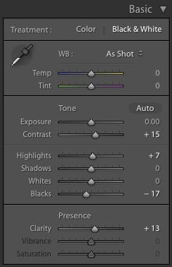
Notice how I haven’t done much to the image yet? That’s the point. Don’t process your image too much and make it look like you always do. The key is to let it breathe and be open to experimentation.
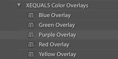
Now, with your image selected, apply the XEQUALS Purple Overlay:
… and BOOM!

… some serious color is now in effect!
Here’s What Happened And Why
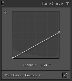
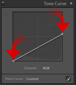
Let’s start with the Tone Curve, some magic has taken place there.
We’ve flattened it out as a way to reduce contrast and compress the image so that the overlay colors can punch up the image.
Let’s look at the Basic settings now:
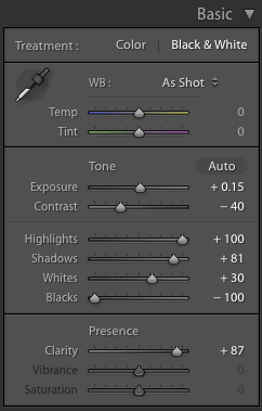
Here’s what we want to focus on:
- Contrast
- Highlights
- Shadows
- Whites
- Blacks
- Clarity
All of these sliders can be used to season your image to taste. I suggest you start with the Contrast, Highlight, and Clarity sliders first before you move to the others (if at all).
If you feel you need to tweak the Tone Curve, you can do so by pulling on the two endpoints within the panel:
What About The Color Itself?
I saved the best for last here, because this is where things get interesting.
Split Toning in Lightroom is easily one of the most underused and interesting features out there.
Simply highlight the color you want for your overlay – keeping your selection the same for the Highlights and Shadows.
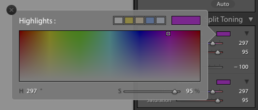
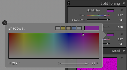
And with that, we have a solid cover overlay, ready for use in Lightroom.
Here’s a quick before/after to show you where we started and where we’ve ended.
It’s All About Creating Your Own Path
Now that you’ve got the XEQUALS Color Overlays in your hands, it’s easy to create an endless array of color variations and styles to suit your unique vision – just like we’ve done here!


