Techniques and Tools
In part 1 of this series, we gave an overview of the basics of creating monochrome images in Lightroom. Today we are going to delve a bit deeper into a few techniques you can use to create magnificent monochromes and more. So without further adieu, let us jump right in.
Toning and Duotones
First off, let’s look at using Lightroom’s Split Toning feature to bring some color back into our images. This is incredibly easy, and can add some feeling to your black and white image. I’m sure you have seen and used the split toning function before, but it really shines when applied over a monochrome image.
Keep in mind that the colors do not have to be contrasting to make an interesting image. Two complimentary colors can accomplish a wonderful effect as well.
In the Develop Module, scroll the Right Toolbar down until you come to the Split Toning panel:
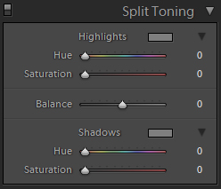
You can see that it offers a few options. First click on the color box to select a foreground color. Get it in the ballpark of the color you want applied:
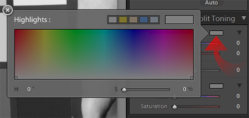
After it’s selected it will apply a color cast over the image, applied mostly to the highlights. Adjust the Hue and Saturation of the Highlight Toning until you like the results.
Next, apply the same Hue and Saturation to the Shadow Toning:
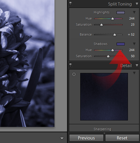
You have created a single color tone for your image. But you can go further with even more desirable effect by choosing two different colors.
Start with the Highlight Tone again, select a color and adjust the Hue and Saturation again. Now for the shadows, select a contrasting color and adjust the Hue and Saturation to taste:
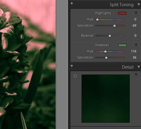
So now we have created a nice contrast of colors in our otherwise monochrome image, but it may seem unbalanced. That’s where the Balance slider comes into play:
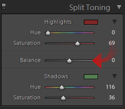
As you pull the slider to the left, you increase the amount of toning applied to the shadows, whilst reducing the toning of the highlights. Push the slider to the right, the inverse occurs. Adjust this slider until you like the results. You have completed your duotone image:
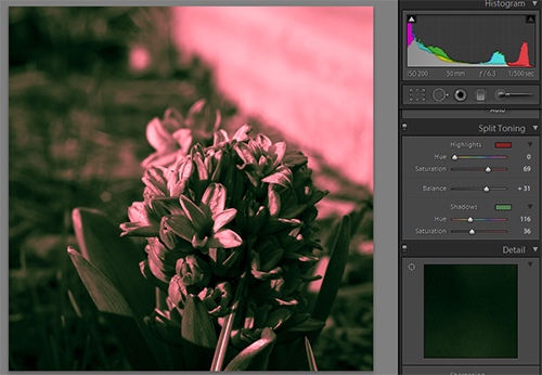
Keep in mind that the colors do not have to be contrasting to make an interesting image. Two complimentary colors can accomplish a wonderful effect as well. You can also apply two, slightly different tones to the Highlight and Shadow, creating an image that has great depth whilst still looking as if it is a simple toned monochrome.
I almost never make a toned image by setting the Highlight and Shadow to the same value, I usually have at least the saturation altered; with less Saturation in the Highlights and more in the Shadow. Experiment and you will find a toning technique that best suits your personal vision.
Selective Color
Selective color is one of the monochrome techniques that is most used in photography today. There are two ways to do this; one can be done exclusively in Lightroom while the other will require Photoshop. First we will explore the rather simple Lightroom only method.
Start this image out in color, and select the Local Adjustment Brush tool:
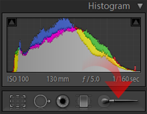
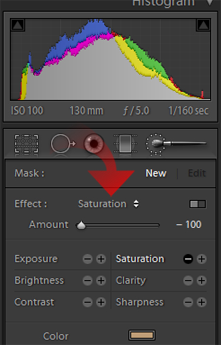
Set its mode to Saturation and bring the Saturation of the brush down to -100. Select an appropriate brush size for the desaturation of the parts of the image you wish to convert to monochrome:
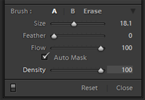
Enable Auto Mask, bring feathering down to 0, Flow to 100 and Density to 100:
Now start filling in the areas of the image you wish to remove the color from:

Auto Mask should do a fairly good job of preventing you from desaturating your subject, but can cause other colors to linger as well. If this occurs, simply let go of the mouse button, align the brush tip centered on the offending colors and start filling in again.
This process will render good results, but with the aid of Photoshop you can do much better.
To do the Photoshop method, first make a virtual copy of the image you want to process. Take one copy and convert to monochrome with the Grayscale Mixer, tune it as if it were going to stay monochrome. With the other, adjust the color of the subject you want to focus on until it is how you like it.
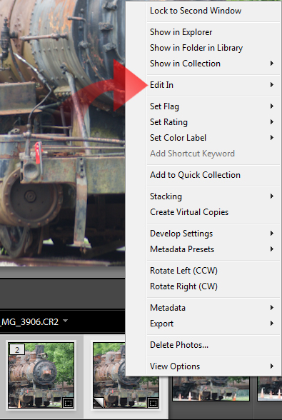
Once both are complete, Control-Click the two images in the film strip. When both are selected, right-click on the selected images to bring up the contextual menu and select Edit In:
In the sub-menu, choose the last option, Open as Layers in Photoshop:
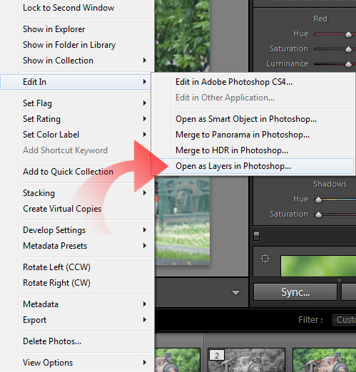
Lightroom will proceed to launch Photoshop and load the two images up as separate layers in the same image.
Once in Photoshop make sure that the monochrome layer is on top of the color layer. You should only see a monochrome image:
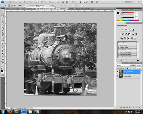
Now you need to remove the parts of the monochrome layer that cover your subject. There is a multitude of ways to do this, but I am going to choose the most straight-forward method and use the eraser tool to remove the top layer:
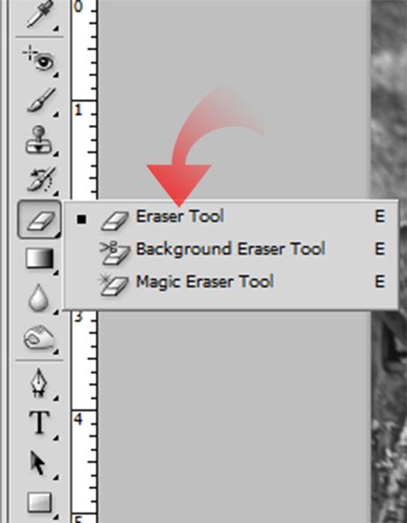
Remember that if there is one way to do something in Photoshop, there are probably a hundred other ways, many of which are better than this method. So go ahead and you the Eraser as a Brush with 100% Opacity and 100% Flow. You can adjust them as needed:

This method provides you with much more control over the monochrome conversion, but if you are happy with a desaturated monochrome, stick with Lightroom and use the first method:

I use the Photoshop method exclusively and it is one of the few image manipulations that I rely on Photoshop for.
White Balance
It may seem counter-intuitive, but white balance can have a major impact on your images. This is a simple adjustment that can make a world of difference in your image. It functions as a variable color filter for your monochrome conversions.
To get a feel for how the Temperature and Tint sliders affect you image, apply them to your image while it is still in color. As you see the different color casts you create think of how that will be converted by the monochrome process:
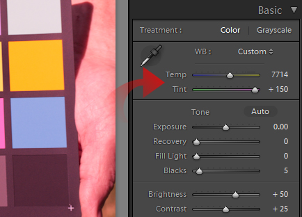
A red cast applied with white balance will create a very dark image when you convert to monochrome and reduce the Red slider in the Grayscale mixer:
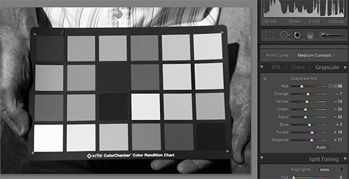
Once you have a feel for how it effects color, set the slider back to normal and convert your image.
After you complete you basic conversion, start moving those sliders around until you like the image:
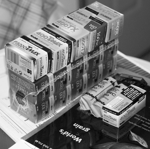
You can use the White Balance tools to enhance detail, eliminate extraneous detail, darken and lighten your conversion:
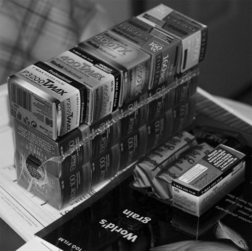
The more you play with white balance in monochrome images, the more you will get a feel for how it will alter your image and will become an invaluable tool for monochrome work.
Grain
One downfall of monochrome conversions in Lightroom is the lack of a tool to introduce artificial grain. You can always go to Photoshop and create grain, but it would really be great for Lightroom to have the option.
All is not lost though. If you know you intend to make a shot into a monochrome image before you take it, and you know you want it to have a pronounced ‘grain’, increase your camera’s ISO setting. As you take it higher the sensor will create more noise, which you can use to simulate grain.
Don’t go all out and set your worst ISO for noise, set it in the middle. ISO 800-1600 on newer cameras will have enough noise to let you enhance it in Lightroom, while having low enough noise to still have a good image.
Once shot, and converted to monochrome in Lightroom, you will want to increase the Exposure in the Basic Tab a bit:
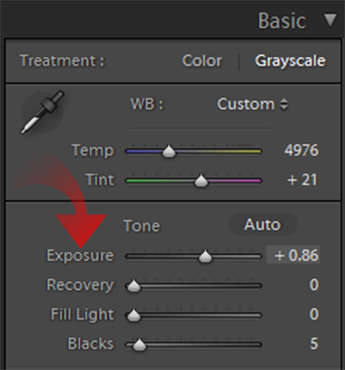
This will enhance the noise a bit to begin with. You can tone it back down with contrast if you need to. Now scroll down to the Detail Tab.
First set both Color and Luminance Noise Reduction to 0 and then apply the sharpening tools until you get the noise to where it looks appealing:
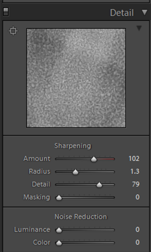
You have now done as much as you can to produce a ‘grain’ in Lightroom, and this is about as good a grain as you are going to get!
That’s A Wrap!
Hopefully the techniques I’ve covered will help you further develop your monochrome skills so you can create beautiful images quickly!
