Black and White photography is one of the simplest yet one of the most powerful visual arts there is. The stark contrast of the blacks and whites uncover a certain truth that lurks in an image, a truth that color often times obscures. For the first decades of photography, color was artificially introduced into an image, until the first color films and processes came about.
Today we are faced with another quandary; creating stunning – impactful black and white images from our digital cameras.
In quite the turnaround, now we are faced with the need to remove colors from our images, as opposed to introducing colors. However with the modern digital darkroom making great monochrome images is insanely simple, especially with Lightroom. By focusing on some key tools in Lightroom you will be creating great black and white pieces in no time.
… we are going to go right for one of Lightroom’s strongest and most versatile tools, the Grayscale Mixer.
So let’s jump on in and start digging around Lightroom’s Black and white tools.
It goes without saying that everything we are going to use will be located in the develop module of Lightroom, so once you find an image you want to convert, open it up in the develop module. For now we are going to ignore the old black and white standby of de-saturating the image, we are going to go right for one of Lightroom’s strongest and most versatile tools, the Grayscale Mixer.
First, make a virtual copy of the image you are working with. This is not required, but it does help to have a color reference for you image, a virtual copy will provide you this reference.
Now look for the HSL/Color/Grayscale tool on the right toolbar:
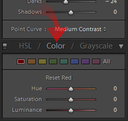
Go ahead and click on the word Grayscale {keyboard shortcut V}:
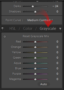
This will automatically convert you image to a monochrome image – automatically setting the grayscale mixer:
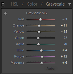
Often this will give you a good result out of the box, but you can always make it better with some attention. The Grayscale Mixer creates your monochrome image by altering the response of each color channel in the list.
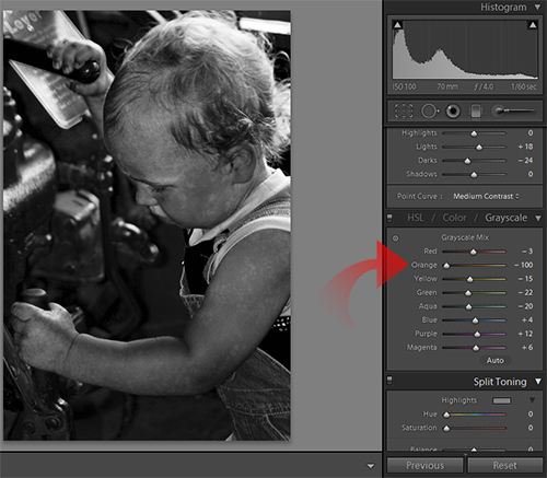
As you move a slider to the left, you are darkening a color’s response curve:
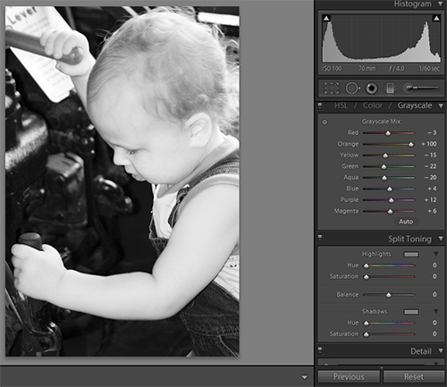
… the right lightens the color’s response:
You need to know where you want the blacks and whites to pop in your image, so you need to know what color channels have what effect. Go ahead and start with red and work through the mixer, first moving the slider to the left and then to the right. This will give you a basic idea of the effect of each channel.
Seeing the changes for yourself is the best way to get a feel for the changes that occur. I will run through some of the color channel basics here though:
- Red – Has a slight effect on skin tones, can also be used to reduce or hide blemishes on skins. Also has impact in floral and foliage photos, particularly in spring and fall.
- Orange – Has the strongest effect on skin tones, regardless of actual person’s complexion. From pale to tan, black to white -most all skin tones respond to orange adjustments. This is your first point of action if you are not satisfied with skin tones in your conversion. Orange is also good again for nature photos, especially fall foliage.
- Yellow – Has a minor effect on skin tones, can be used to lighten teeth and eyes if needed. Also has impact on grasses and other greenery.
- Green – Green is an important channel for outdoors, as it covers most all plants in some way. It has little effect on people, but green has a drastic effect on landscapes.
- Aqua – Has effect on water and skies, although not as much impact as blue; also will be present in grasses.
- Blue – Biggest effect blue has is on skies and water and little effect elsewhere.
- Purple and Magenta – No consistent definable effect, however can make an impact on shadows and can have a surprising impact in natural settings.
As I said previously, you need to experiment to get a proper feel for each colors effect. My observations are just that, my observations. Those points are the most important to me – your style will dictate what is important to you.
I suggest a good ‘S’ curve for your tone curve, adjust the curve until you like the look …
So go ahead and play around with the color channel sliders until you get close to what you are going for. Watch for area you feel could be further improved. After you get you basic tone set, click on the Dragging tool in the Grayscale Mixer tool box:
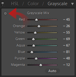
This will give you a tooltip you can place in your image where you see the need for a more refined improvement. Click on the part of your image you wish to improve, while holding down the mouse button, drag your mouse up and down.
The image will automatically be adjusted as you move the mouse, up lightening the image and down darkening it (Left and Right work as well). This will allow you to adjust you overall image to perfect the tone, you can see what color channels are affected as you move the mouse, just keep an eye on the Grayscale Mixer as you move the mouse.
Now that you have your conversion more or less done, you need to pay attention to the normal development issues. First and foremost for monochrome images is the contrast and tone curve of the image. I suggest a good ‘S’ curve for your tone curve – adjusting the curve until you like the look:
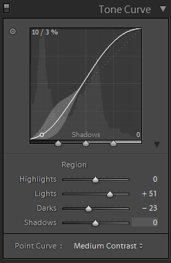
Next you want to adjust the global contrast slider in the Basic tab to your tastes.
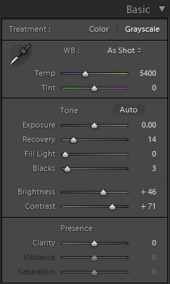
Bounce back and forth with these two until you get it perfect. Don’t underestimate the importance of you contrast and curve, they are as vital to a monochrome image as the actual Grayscale Mix.
Now you are ready to put the finishing touches on the image. By now you should have the image looking just about right. The next step is dodge and burn the image. Traditionally in the darkroom, each print would be hand printed; during exposure the photographer would often manipulate the exposure in parts of the image.
This was called dodging (lightening parts of the image by cutting off the light) and burning (focusing more light on part of the image to darken it). The same can be done in Lightroom via local exposure adjustments.
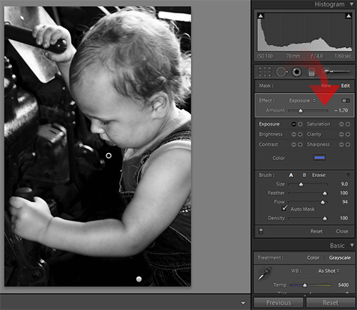
Find a part of the image you want to adjust, select the Selective Adjustment brush:
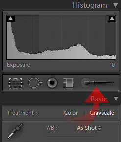
Then color in the area you wish to dodge or burn. After you have made you selection, simply increase or decrease the exposure setting for the local adjustment:
After any local adjustments are made, you need to sharpen your image and address the noise in the image. You can choose to use the noise reduction tools to decrease the effect of noise in the image or to enhance them. Oftentimes you may find you want to turn off noise reduction and sharpen harshly to enhance noise, simulating grain.
Other times you will want no noise and a sharp image. Again still you may want to not sharpen much, leaving a soft image with noise reduction applied. This is all a matter of taste and desired results.
Play around with these settings, but be sure to always pay attention to them, as every image is unique and will require special attention in this area:
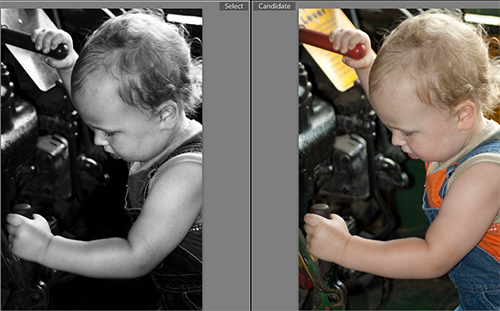
By now you can see that you can get better, more precise results from using the Grayscale Mixer in Lightroom as opposed to simply desaturating you image. This should get you on the way to creating great Black and White images, play around some and see what you can get.
For now, get a good grasp on these basic tools and start cutting you images down to raw emotion. Color can sometimes overtake an image, muddying its impact and meaning. Black and white imagery removes this obstacle and opens you up to the rawness of the moment.
In Part 2, we’ll look at some more advance techniques to utilize on your monochrome images and some tools to make the task easier.
