Working with the the Lightroom Book Module
I love picture books. For me, it’s just not a photograph unless it’s been printed and either hung on a wall or bound into a book. I’ve made a few books of photographs using Blurb’s BookSmart software, so I was rather excited to see the new Book module make an appearance in Lightroom 4.
The problem with using BookSmart was always one of keeping the images synchronised with the Lightroom originals. This was ameliorated somewhat when Blurb brought out their Publish plugin – finally I didn’t have to keep manual track of which images I’d recently changed. There was still the issue of having to swap between apps, and being confident that BookSmart had picked up the latest version, but, well, life needs its little hardships.
The Lightroom Book module is capable of producing perfectly adequate books and, for many purposes, it’s all you’ll need.
But now we can create a Blurb book right inside Lightroom: no app switching, no worries about picking up the right version, no need to remember to hit the ‘Publish’ button. But how does it stack up against BookSmart as a way of constructing a book? I already knew that you can’t edit or create custom templates, but how much of a problem would that prove in real life?
To test this out, I decided to try re-creating a book (here) that I’d made about a year ago as part of a project for my college photography course. It’s a fairly simple book, less than 40 pages with only a couple of pages of text and it mostly uses standard BookSmart page templates, so it seemed a good choice for a first dive into the murky realms of the Lightroom Book Module.
Before we start
This is not a tutorial. For that, I can heartily recommend Julianne Kost’s excellent 3-part video series over on Adobe TV (Part 1, Part 2, Part 3). What I will be doing is recounting my experience of trying to put together a book based solely on having watched Julianne Kost’s videos and poked about with the Book module a couple of times. As such, I’ll have made mistakes, gone down blind alleys and not have done things in the most optimal way – but that’s part of the learning experience and also a function of the effectiveness of the user interface.
Let’s dive in
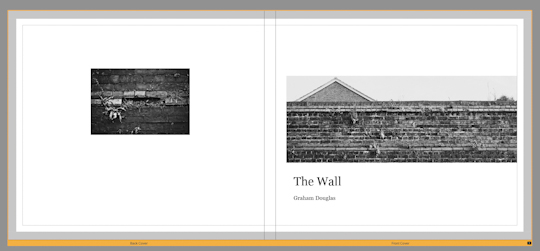
For reference, this is the book in BookSmart, showing the book’s cover.
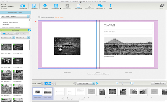
Since I’ve already made the book, I have a collection inside Lightroom containing all the images that I want:
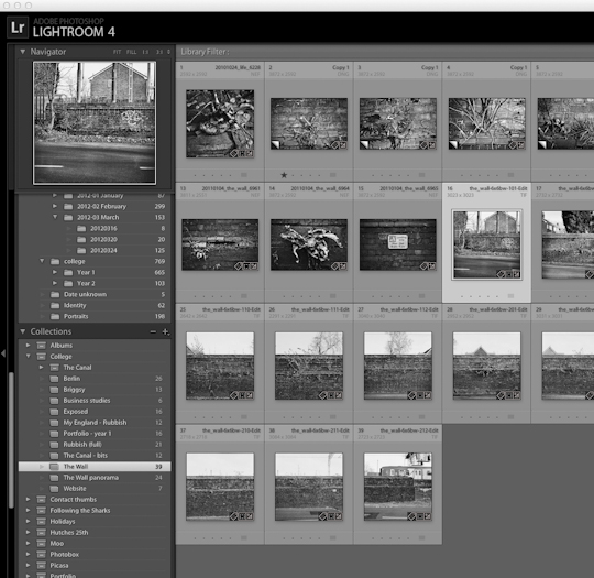
so, I select the collection and enter the Book module.
(At this point Lightroom will, by default, ask you if you want to autofill the images. Personally, I don’t see the point in doing that right at the start, so I had already turned the preference off):
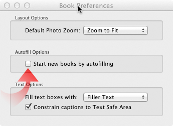
This preferences dialog can be found under the ‘Book’ menu when you’re in that module.)
What type of book?
The first thing to consider is the size and style of the book you’re creating. I already knew that I wanted a Standard Landscape, soft cover, Premium Lustre paper (I was a poor student – it needed to be cheap, OK?). And here comes the first deal-breaker: no soft cover option. I could have Hardcover Dust Jacket or Hardcover Image Wrap, but no Softcover option was available.
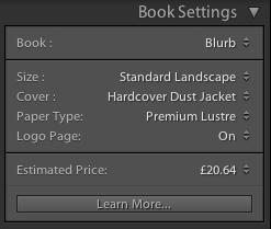
On the plus side, though, it does give you an estimated price right up front: something you don’t get with BookSmart.
Laying out the book
So now it’s time to get the pictures into the book in something approximating the final order. I had a couple of things to consider at this point
- The collection contains more pictures than would eventually be used in the book
- There are two ‘sets’ of pictures – a main ‘narrative’ set and a ‘details’ set.
What I would like to do is to use Auto Layout to put the narrative set in place, and then add the detail images manually. Easier requested than done, though – Auto Layout uses all the pictures in the film strip, even though I had selected the ones I wanted to put in. I think Adobe have missed a trick here: Auto Layout is potentially a time-saver, but without a little bit more control you could end up wasting as much time as you’d saved undoing some of the things it’s done.
Still, in this case it’s simple enough to correct, since all the pictures I want to remove are consecutive, so I click on the first page and then shift-click on the last page. That didn’t do what I wanted, though – it only selected the two pages that I clicked on.
It took me a little while to figure out what was going on here: you have to be careful not to click on an image or text cell, because then you’re selecting cells (for which range select doesn’t really make sense). Unfortunately, Auto Layout had used a full-bleed template for every page, so it’s impossible not to click a cell if you click anywhere on the page thumbnail.
The best way I’ve found to ensure that it’s pages you’re selecting is to click on the page number under the thumbnail. That way, range select works just fine.
This still left another issue: I couldn’t find a way to autofill using a specific template: no matter what I tried, it always created new pages using a default, full-bleed template. I assume that I’ll find out how if I dig a bit deeper, but I’d just like it to be more obvious, if there is a way to do it. Anyway, it’s simple enough to select all the pages and apply a new template that’s more like the one I want.
So, the book now looks like this:
Time for a break…
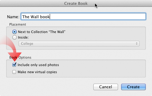
At this point, I felt that I needed a break. Before sloping off for a nice cup of tea, though, I thought I’d better just save the book and get rid of that distressing ‘Unsaved Book’ label at the top of the page. So I clicked ‘Create Book’, gave it a name in the subsequent dialog and clicked ‘Create’. If only I’d spotted that check box lurking, I’d have saved myself another minor annoyance a bit later on…
So, back to the book. To recap, I’ve got the basic narrative pictures in place; now I have to tidy up the layout and insert the detail pictures, add the text pages and fix up the cover. As reminder, this is what the book looks like at this stage:
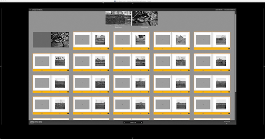
It’s looking OK, but all the pictures are in the middle of the page – in the original, I had moved them to the right and slightly down to break up that symmetry and give a bit more ‘life’ to the page. In BookSmart, this is quite easy – you just select all the images and apply ‘Align Right-Bottom (don’t crop)’. This will fit the image and align it to either the right or bottom edge of the cell, depending on the relative aspect ratios. But there’s no such option in the Book module.
At this point (given hindsight) I made a possible mistake – I started looking around for a layout template that put the image more to the right of the page and eventually found a two-picture layout that seemed to work. (This image includes the effect of padding as described below.)
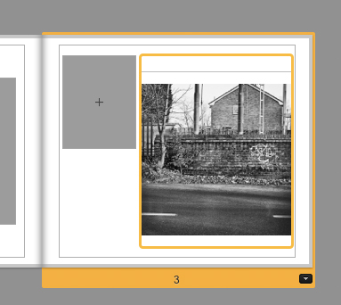
It’s worth pointing out here that, just because you want to put only one picture on a page, doesn’t mean you should restrict yourself to looking only in the ‘1 Photo’ layout section.
So, I’ve got the pictures over to the right, but they’re still in the middle vertically. Now I remembered what I should have remembered before: namely, that you can adjust the padding around the picture within the cell.
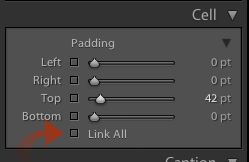
By deselecting the ‘Link All’ checkbox, you can control the position of the image. Here I’ve added some padding to the top to move the image down in the cell to the position I want. I could have moved the image around in the original layout, by adjusting the left and top padding and saved myself the task of applying another layout. That would work, but it would have made the image smaller and may not have looked quite right. As with so many things, there are multiple ways of achieving an end, and you may need to experiment to find the best one in any given circumstance.
One thing I found that surprised me slightly is that copying and pasting a layout (select a page, right-click and choose ‘Copy Layout’ – or Cmd/Ctrl C, select another page, right-click and choose ‘Paste Layout’ – or Cmd/Ctrl V) inserts a page in front of the second one you selected. My initial feeling was that pasting a layout on a page should change that page. To change a page layout, you have to click on the down arrow at the bottom-right of the thumbnail and choose the layout you want – this works across a multiple selection, by the way.
Finishing the main section
Given what I had learned from the previous attempts, it was a fairly simple matter to add the rest of the pictures in their correct places and move them into the positions that I wanted.
One minor annoyance cropped up here, from the point where I had initially created the book – it only copied over those images from the original collection that I had already added to the book. Remember that the Create Book dialog has check box that I missed first time around:

It meant a quick round trip to the old collection to transfer the remaining pictures to the book collection – a small thing, but something to remember for the future.
Adding text pages
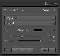
This turned out to be the simplest process so far – it was just a matter of looking for a template that had a text box in approximately the correct position, and then using the justification controls (seen at the bottom of the Type control panel) to position it to my liking.
Headers and footers
This is a feature that I wasn’t able to replicate exactly. The original book had page numbers at the bottom and the book title at the top of the page. The Book module allows you to add a page caption at the top or the bottom but not both, so I could have either the title or the page numbers.
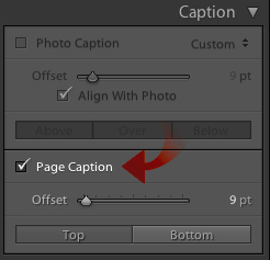
Add to that that there doesn’t seem to be a way of automatically inserting the page number, and we have another potential deal-breaker.
The book cover
This was the trickiest part of the book to reproduce, and the least satisfactory, since there was no template that was at all close to the original layout. The best I could come up with was this layout:
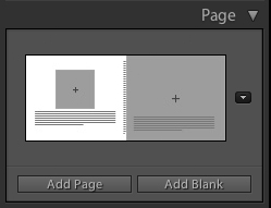
To get the long, thin image, I made a virtual copy of the ‘real’ image, cropped it to the appropriate aspect ratio, and positioned it within the (full-bleed) cell using the padding controls as before. The image for the back cover was near enough, so I didn’t change it. Front cover text was easy enough to add, but I could not replicate the positioning of the original.
I should add that I could have used the ‘whole page picture’ trick that Julianne Kost describes in one of her videos (basically, construct the page as an image using something like Photoshop, and just add it to the book on a full-bleed template). Yes, that would have worked here, but as a general solution, it’s not really practical if you have more than a few pages to mock up this way.
Conclusion
The truth is that I like the Book module, but I’m not going to be ditching BookSmart in the foreseeable future.
The Lightroom Book module is capable of producing perfectly adequate books and, for many purposes, it’s all you’ll need. If you want more control over your layout, though, you’re going to find yourself going back to BookSmart or InDesign.
I should also point out that this review is based on a little bit of poking about after viewing Julianne Kost’s tutorials, in addition to the project described here. If any of this article sounds negative, that’s probably more to do with my unfamiliarity than any real failings of the module. I’m sure that, if I tried to do this with another book, it would all go much more smoothly, and with possibly better results.
That said, there are things missing that could make it into much more serious contender for being the go-to tool for creating serious books.
My suggestions for things I’d like to see in the Book module in future releases:
- Editable templates, please!
- More automation for things like page numbering, book title, author.
- The ability to export the book so that it could then be imported into BookSmart or InDesign. That way, you can get the bulk of the book done in Lightroom and tweak it in a more powerful editor (not unlike tweaking photos in Photoshop after developing them in Lightroom).
Of these, the ability to export the book would probably be the simplest addition that would cause me to use the Book module by choice every time: it shouldn’t be under-emphasised that staying within Lightroom whilst creating the book is a great boon. To be able to quickly switch to the Develop module to tweak a picture or to be able to quickly add a photo from anywhere in your library really is a time-saver.
I want this module to be great. It’s not there, yet, but it’s early days and it’s certainly well on the way.

