Some of the biggest changes that appeared with the release of Lightroom 3 were improvements to the Print module. With a large variety of templates to choose from as well as the ability to easily create custom layouts, the Print module is more useful than it’s ever been.
Start by selecting the photographs that you want to print and put them into a Collection. In the Library module pressing the B key will add them to a targeted collection (Quick Collection is the default) or you can add them to a Smart Collection or drag into an existing collection.
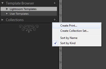
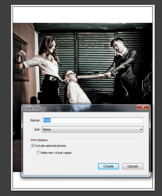
Alternatively, start from the Print module, select the images you want to print in the filmstrip at the bottom of the screen and click on the + in the Collections panel and select Create Print. This will group your selected photographs together in a collection that will be easy to return to in the future.
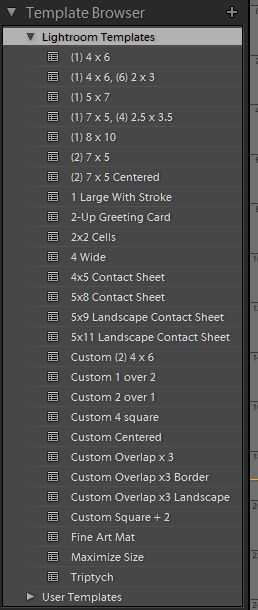
The quickest and easiest way to get your images off to the printer is to use one of the included templates. Lightroom ships with a number of different templates and you also have the option of creating your own and installing templates created by others.
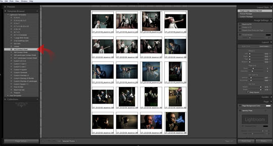
Creating a contact sheet is one of the more useful options when printing from Lightroom. If your backup and archiving routine includes optical media, contact sheets can save you time when you’re desperately searching for that one image from a shoot that you know was sometime in 2008. A quick glance at the contact sheet can tell you what’s on the disc without the need to load it up.
To create your contact sheet, select all of the images that you want to include. This may be all the included photos in a Collection or you may make selects from the filmstrip. With the included templates you have 4 options for contact sheets in 2 formats, square and landscape. With square you can choose either 3 x 5 cells or 5 x 8, and with landscape the choices are 5 x 9 and 5 x 11. Note that these are the number of rows and columns, not the size.
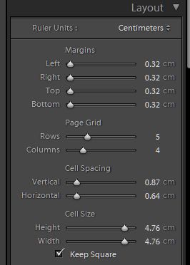
If these options aren’t suitable you can easily create a customized version of your own. Head over to the Layout panel on the right of your screen and you’ll have options for the size of the cells, the number of rows and columns, margins and cell spacing. Set these to suit your own needs and you’re good to go.
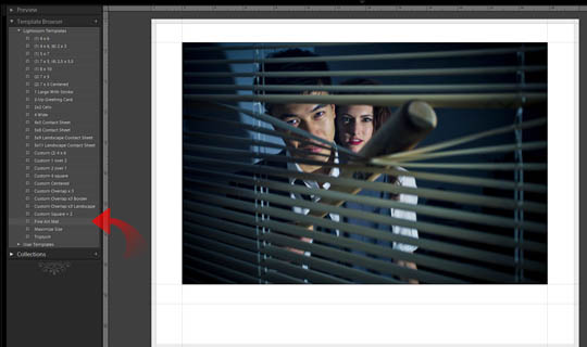
From many small images per page to one large one, the Print module makes it easy to swap between styles. Selecting the Fine Art Mat from the templates menu lets you a large matted print of a single image. As with the contact sheet, you can adjust the various options in the Layout panel if need be to allow your photo to be displayed however you like.
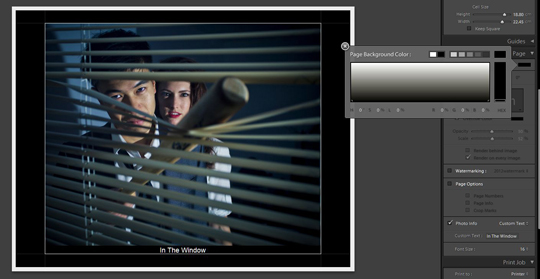
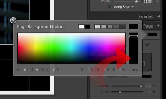
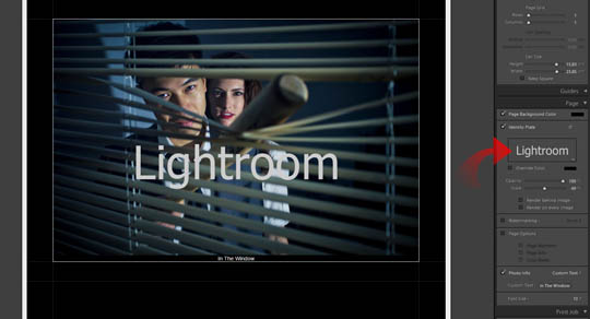
With the photograph selected and displayed in the main window, head into the Page panel for a few extra options. The first choice is Page Background Color. The default background is white and as you can see in the screenshot below, I’ve opted for a black background instead. Don’t let the gray scale look of the flyout trick you though – simply click in the vertical bar to the right and it’ll bring up the color options.
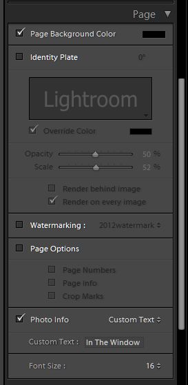
If you want to add custom text over the center of the photo, then the Identity Plate is the way to go. In the example shown below I’ve left it at it’s default which reads Lightroom. You can change this to anything you wish or add a graphical identity plate The downside of this method though is that it can only be placed in the center.
If you want your text underneath the image, use the Photo Info checkbox at the bottom of the panel and select Custom Text. Alternatively, you can choose to display the title, filename, copyright, exposure information, date and more.
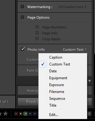
Once you are ready to print, turn your attention to the Print Job panel. You have the option of sending your work directly to your printer or printing it to a JPG file if you wish to send it to a lab. If you’re printing a quick contact sheet or any other job where the photos are small and quality of the print is not important you can turn on the Draft Mode Printing option.
This will render the print from the cached photo previews not the full size file which is good is you need something printed as a quick reference.
For most printing you’ll leave this off. You then have options to set the print resolution, a choice of three levels of sharpening, media type (matte or glossy) and color management.
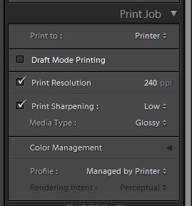
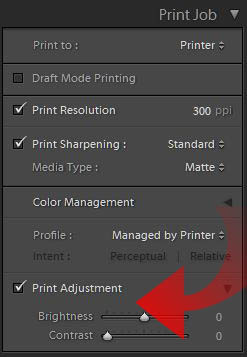
While putting this tutorial together, Adobe made available a public beta release of Lightroom 4. The Print module is mostly the same in this new release although there is one major change in the Print Job panel. At the bottom of the panel you now have a Print Adjustment section with sliders for Brightness and Contrast.
These are useful for people who don’t have properly profiled and color managed printers. They allow you to compensate for printers that give results that are too dark or light, or that lack contrast. Note that it’s a setting that is specific to the printer / paper / ink and once set, would only need to be adjusted if the printer / paper / ink combination changes.
Give some of these techniques a try and watch the quality of your printed photographs improve.
