We previously discussed what makes a good watermark and how it can help potential clients find the real you.
Now, let’s get down to business using Lightroom and Photoshop to construct our watermarks!
Lightroom’s Simple Copyright Watermark

Lightroom’s Simple Copyright Watermark pulls text from each image’s Copyright metadata field and renders it in the lower lefthand corner of the image. Using this feature can be useful when exporting a batch of images requiring individual, variable watermarks.

To use it on image export, enable the Watermark checkbox and select Simple Copyright Watermark from the drop-list of choices. Be sure that each of your images has its Copyright IPTC field filled out beforehand.
The downside to using the Simple Copyright Watermark, though, is that it’s entirely bland and thoughtless. Because it’s an easy, single checkbox option available when you export; it’s as wildly overused as you’d expect it to be. If utility demands that you pluck watermarks from individual image metadata, then so be it; otherwise, give the Simple Copyright Watermark wide berth. With minimal effort, you can do better.
Lightroom’s Custom Watermarks
To create custom watermarks in Lightroom, enable the Watermark checkbox and choose Edit Watermarks… from the drop-list of options. Lightroom will present you with a dialog box containing customization options.
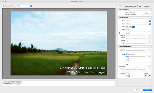
There are some useful options here, but not much creative flexibility. You can choose
- font face and style
- color and alignment
- apply drop shadow and transparency
- and set the watermark’s position.
Rather than pulling text from image metadata, Lightroom will use whatever text you provide. You can create additional lines in the text box by pressing OPT-RETURN on Mac, ALT-ENTER on Windows. However, you cannot apply styling separately to each line; style settings apply equally to all text.

While this is an improvement over the Simple Copyright Watermark, it is still less than ideal.
The shining star here is the ability to import a graphic watermark. We’ll come back to this, but the graphic must be prepared externally.
Bring on Photoshop.
## Creating a Watermark in Photoshop
Let’s just say it outright: creating a watermark in Lightroom leaves much to be desired. If you want to craft your watermark, then Photoshop is the place to be.
To begin, create a new image on a 960-by-250-pixel canvas, with a transparent background. Our watermark won’t be this big, but it gives us plenty of breathing room to work comfortably.
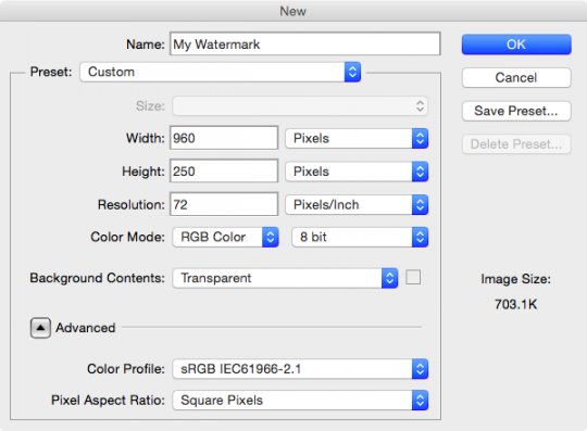
Set your foreground color to white, and the background color to a dark gray. I like to use #333333.
The new image will have a single layer; fill the layer with white. Create a second layer, and fill with your background color.
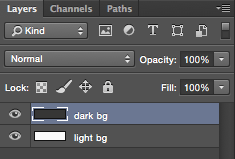
These two layers will help us to preview our watermark on a light and dark background. We use a dark gray because we will be adding a black drop-shadow to our text; on a black background, we wouldn’t be able to see it.
Let’s begin work on the dark background layer. Create a white text layer and fill in your web address. This white text layer is for the main text for our watermark.
At this point, I like to work with my text layer vertically centered. I drag out a ruler guide, offset 10-pixels from the right edge of my canvas, and I position my text against it.

I’m working on the right side and keeping my watermark right-aligned because I plan to position it in the lower right-hand corner of my images. The lower right is where artists traditionally sign their work, and so, with many centuries’ worth of precedent and conditioning, it’s where we are most accustomed to seeing a signature or watermark. Positioning the watermark in any other location distracts from the image.
Back to Photoshop, press the fx button in the layers palette and apply a drop shadow to your text.
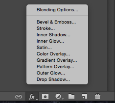
The purpose of the drop shadow is to offset the text, ensuring that it remains legible on a light background, so you might want to switch to the white background layer while adjusting the drop shadow parameters.

I like to keep the drop shadow fairly tight to my lettering so that it offsets the text on all sides.
At this point, you can start experimenting with font face and style. Resist the urge to use overly stylistic fonts; we don’t want people guessing at how to spell the web address.
Pro tip; If you have a logo for your photography business, maintain brand consistency by using the same font.
Adjust the text size and kerning to ensure good readability, because this watermark is superimposed on all sorts of images. Consider rendering the web address in all uppercase letters; this helps to maintain legibility and can also offset the main text from the subtext we’ll be adding.
Let’s add that subtext, whatever it may be. Create another white text layer and type out your subtext. Right-click the main text layer and copy its layer style. Paste it onto the new text layer so that we have our drop shadow. Right align the subtext layer and position it beneath our main text.

At this point, you may feel you are finished. That may or may not be true, but we won’t know for sure until we’ve tried our watermark on some images.
Save the image in its current state. We are going to take some additional steps to prepare the image for use, but these next steps we do not want to save; we want to be able to return to our design canvas.
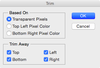
Disable both light and dark background layers so that our watermark is floating over transparency. Go to the Image menu and select Trim…, in the Based On options Transparent Pixels, and trim away all sides.
In the File menu, select Save for Web….
Use the PNG-24 preset, and then save the image to a folder for long-term storage, where you will always be able to find it.
At this point, my watermark looks like this:

I’m using a dark background so that you can see it here in the article, but my working file has a transparent background.
Let’s take this thing into Lightroom!
Applying a Graphic Watermark in Lightroom
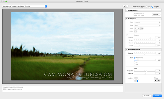
Back in Lightroom, exporting our images, enable the Watermark option and select Edit Watermark… from the drop-list of options.
In the watermark dialog, select Graphic for Watermark Style in the upper right hand corner, then navigate to your new PNG watermark file. After selecting your file, you can close the Image Options and Text Options panels: we’re done with those.
Working in the Watermark Effects panel, I set Opacity to 50. I want my watermark to be visible, but inconspicuous so that it doesn’t distract from the image. I anchor the watermark in the bottom right corner, then set Proportional sizing and experiment with the slider until I find an acceptable value.
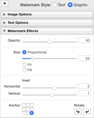
When satisfied with your settings, export several images with your new watermark. Choose images in both landscape and portrait orientation, light and dark, and export the images at a size that is typically for what you will be putting on the Web. Use these images to evaluate your new watermark.
Remember, crafting your watermark is a balancing act.
Should the watermark be more or less opaque? Does it strike a good balance between being legible and being distracting? Are the main text and subtext both sufficiently legible? Tweak your watermark and re-evaluate until you’re satisfied with what you have.
Don’t forget to save your watermark configuration as a new preset in Lightroom so that you can easily apply it to your exports in the future.
Here are a few images with our new watermark applied:



Remember, crafting your watermark is a balancing act. Too small and it will be illegible; too large and no one will want to look at your images. Too transparent and it will be invisible. Too opaque and it will be distracting. Ultimately, it’s all up to you, but with some experimentation you should be able to create something universally applicable for your website.
To help you out, you can download a PSD starter file right here.


