I’ve been shooting jazz concerts for a while now, and lately I’ve been thinking about what makes a concert shot iconic. In many cases, the viewer of a particular concert photo will have no idea who the artist is, so one way to keep the viewer interested is to express a mood – a black & white atmosphere that is quintessentially jazz.
One way to do that is to go back to the roots of jazz photography and learn from those iconic pictures. Because of the technical constraints of the times, most of these shots are black & white, and what we’d consider underexposed today: large parts of the picture are in the shadows.
With modern digital gear, it doesn’t have to be this way. For a long time I shot for the details and processed to enhance those details even further. While there’s nothing inherently wrong with that, sometimes this didn’t really convey the atmosphere and feel I was looking for.
… just because I can get a perfectly exposed, and detailed subject by shooting at 3200 ISO or more doesn’t mean I should.
What I’m going to talk about today is an approach that I’ve started to explore which I call ’embracing the shadows’. Essentially it comes down to this: just because I can get a perfectly exposed – detailed subject by shooting at 3200 ISO or more doesn’t mean I should.
Shadows are part of what makes jazz concerts the experience what they are.
So what I try to do these days – at least for part of my shoot – is to expose so that part of my subject(s) will remain in the shadows. I tend to do this by trial and error and generally expose manually. I’ll open no lower than F/2.8 or F/4 depending on the lens, at ISO 400 or 800 depending on the lighting, and adjust the shutter speed to get the desired shadows.
All photos © Benoît Felten
Once I’ve selected a shot with potential, I’ll complete all of the adjustments required in Lightroom prior to switching to black & white (cropping, eliminating background clutter, etc.).
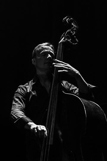
With that work complete, I use the XEQUALS Black & White presets to save a lot of time by quickly comparing multiple options. For the shot ‘Thomas in the Shadows’ shown here I created 5 virtual copies and tried 5 different emulations as shown on the screen capture:
- Fuji NP Acros 100,
- Agfa Scala 200,
- Rollei IR 400,
- Ilford Pan F 50+
- Tri-X 1600 Acufine.
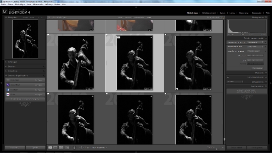
I then compared them, looking in detail at how the shadows were falling on the face. That led me to eliminate the Scala and the Rollei which were too bright for what I was after, and the Ilford which was too contrasty.
I then debated a while between the Fuji and the Tri-X before finally going with the Fuji.
I often hear that “real” photographers don’t use presets, and I find that assertion baffling.
For this shot I really wanted the face to be in the shadows but still faintly visible. I also wanted the beautiful curve of the bass to stand out: it’s a strong graphical element of the shot.
So I lowered the overall exposure by 0.15 and darkened the shadows by -45. That gave me some really deep blacks without burning the face entirely.
All in all, I probably spent less than 10 minutes processing the shot.
All photos © Benoît Felten
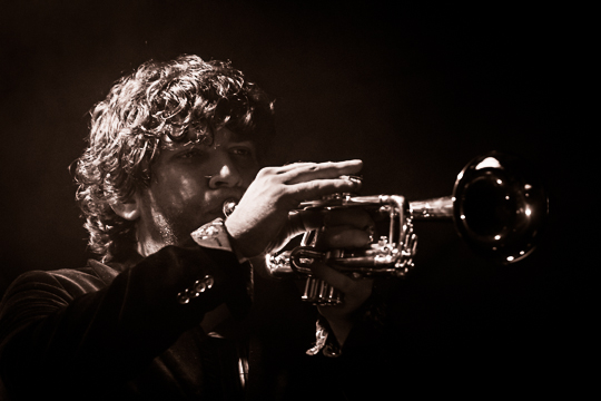
For ‘Trumpeter in the Dark’, I had the same philosophy in mind. I liked the fact that the musician’s face was partially in the shadows and I wanted to keep it that way. The difference with the previous shot was that instead of having a dark area and a light area, the face was dark but speckled with light spots. I needed to retain enough highlights to keep it legible.
Before processing for B&W I had to get rid of a pesky microphone stand on the right, adjacent to the trumpet. So I exported the image to Photoshop, edited out the stand, and then imported the image back in Lightroom as a TIFF.
I then approached things in much the same way as I did for the previous shot:
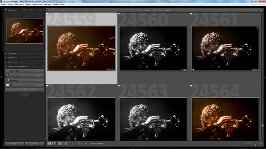
I tested a number of black & white emulations, some more contrasty than others to find the base I liked. I ended up choosing the XEQUALS Agfa APX 400 emulation.
I liked the tone and contrast levels, but it blew up the highlights so I had to do some fairly radical adjustments to compensate for the hand and hair.
I lowered the overall exposure by -0.5, boosted the highlights by +75 but brought the whites all the way down to -100.
I then brought the blacks down by -45 to maintain a really deep black in the background. I also boosted the eyes a little bit with the adjustment brush, while burning the remaining highlights on the hand with the adjustment brush.
Some of the other interpretations were interesting too, with more detail on the face, but ultimately I decided I liked the sense of mystery and the mood on this version. I wanted to give it a slightly warmer feel though so I applied an XeL B&W Sepia 1 toning to convey that.
Choosing which film to use for one’s shoot is exactly the same mental process as using presets except we now have the flexibility to apply that choice to individual shots.
As I said at the beginning, my goal with these shots was to favor mood over detail, and the option to sample different black & white emulations was a great way to achieve that as it allows you to see beforehand which one best suits the mood that you’re after.
Since creating virtual copies in Lightroom is easy and doesn’t eat any disk space, it’s a really great way of focusing on the version I think will best express what I’m after, and then tweak it as necessary to really get a final shot that rocks.
I often hear that “real” photographers don’t use presets, and I find that assertion baffling. Choosing which film to use for one’s shoot is exactly the same mental process as using presets except we now have the flexibility to apply that choice to individual shots.
Film photographers would then tweak their shots during printing, and just because we use presets doesn’t mean we shouldn’t similarly adjust once we’ve chosen a preset to express exactly what we’re after.
