Guest blogger Michelle Moore takes on a topic that doesn’t get discussed as often as it should: Composition.
If you’re not familiar with Michelle’s work we suggest you check out her perpetually insightful post on working with Natural Light.
This girl has serious talent!
Luckily for us all, Michelle is also good on a keyboard, and took some time to discuss with us her approach to composition and some of the fundamentals we should all consider when crafting an image.
Composition. What does it mean?
Definition:
The nature of something’s ingredients or constituents; the way in which a whole or mixture is made up. The action of putting this together; formation or construction. A thing composed of various elements.
Sure you can read about composition in your photography book or online, and yes, you’ll learn the rules, but I’m here to teach you real-world application and when to follow or break those rules.
Don’t rely on thinking you can crop, or Photoshop things out later.
Study great photos, analyze why it seems to work. Notice when photos make you feel uncomfortable. Are they “breaking the rules” or simply being lazy? Train your eye to see good composition everywhere and soon it will start to come naturally. My rule of thumb is to always frame in-camera. Pay attention to all the details. Don’t rely on thinking you can crop, or Photoshop things out later. Stop and pay attention, and treat your images as digital negatives, and practice getting it right the first time.
I’m going to assume you know the fundamental concepts and key terms behind good composition such as the Rule of Thirds, Empty Space, etc. If you need to reference the basics of composition check out a few of these online articles, or check out a book or two,
- 5 Elements of Composition
- Photographic Composition
- The Elements of Photography
This article will cover a few key composition elements to create gorgeous and successful portraiture images. I’ll describe 4 of my favorite composition elements, why they work for me, and how you can make them work for you!
Rule of Thirds & Negative Space
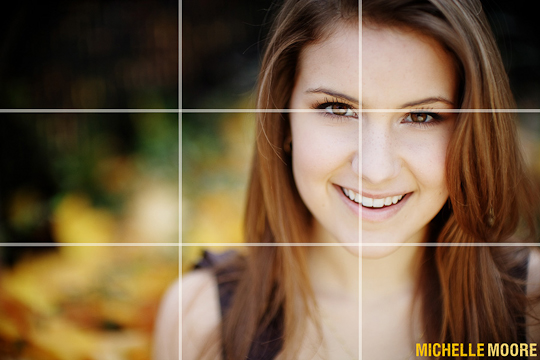
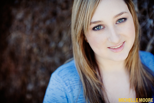
The rule of thirds is about splitting your frame into three sections, whether it’s from top to bottom or left to right. Think of framing your subject on the right third of your frame, or the bottom third, etc. This gives a really nice, pleasing framing to your subject. I also adore negative space, which is something you can create by using this rule of thirds element. If you are doing a really nice beauty close-up of your subject, I recommend using a shallow depth-of-field.
This will create a really nice soft blurring effect, and create a stunning portrait that leaves ALL the focus on your subject. Be careful for things in the background – as you do not want distracting elements off to the side. Shooting at a very wide aperture (anywhere between f/3.5 – f/1.4) really helps.
Plus, more often than not you can find everyday elements (such as a field of grass, a brick wall) that create unexpected textures. Don’t be afraid of the negative space. It’s good to leave a little room for your viewer to breathe.
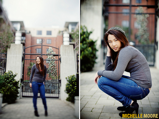
The rule of thirds also applies to wide shots where you can see your entire subject. Paying close attention to this rule will allow you to create absolutely arresting images. As you include more of your subject in the frame, you’ll really want to pay attention to the additional elements composing your negative space. Are they complimentary to your subject?
Are you balancing your subject? Even if you are shooting wide open at f/1.4 – because you are further away – things will be less out of focus, than when you are inches from your subject’s face. Think of the angles, where you client is looking, etc. If they are walking to the right, you’ll probably want to frame them on the left side.
Why? Because they need somewhere to go in the frame. If the subject is looking away, or headed somewhere, make sure you give them somewhere to go otherwise your viewer is going to be distracted and trying to look off-camera and whatever seems more interesting – because that’s where the subject is gazing.
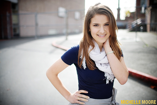
Shooting wide – and getting your entire subject in the frame is more challenging because there are so many elements involved, but you can get some really great work if you pay attention to the rule of thirds, and negative space. Shooting horizontal will create those sweeping cinematic looks, and shooting vertical will create awesome magazine worthy shots.
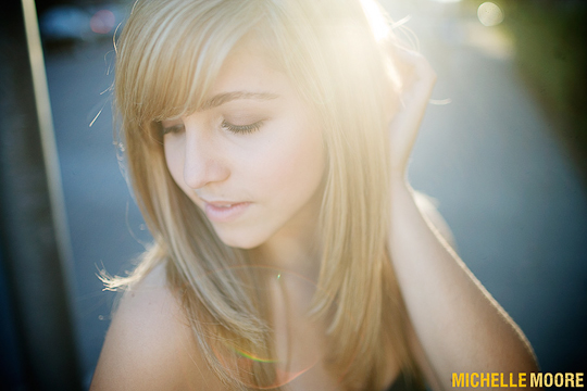
Pay attention to your lighting in the close-up shots. You’ll want smooth even lighting, such as in open-shade, or you can create some nice flare with a back-lit shot (don’t forget your reflector for fill!). Wider compositions are a bit more forgiving with lighting. You can create nice angles, and shadows with the light, and/or open shade is always perfect for a nice even look – the image is found always comes to mind when I think of great composition that uses light and shadows in innovative ways.
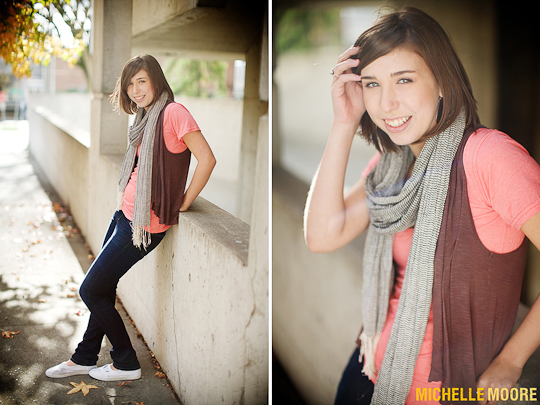
Fill the Frame
Filling your frame is the opposite spectrum from the rule of thirds, but still uses similar elements. For example if doing a beauty shot, you’ll want to make sure the eyes are on the top third of the frame for strong compositions – unless you are bending the rules. I love images where the subject fills the entire frame.
Having good lighting will take this composition from dull and flat to bursting with emotion.
You can elicit so much emotion from your subject, be it sad, happy, contemplative, etc. Creating a gaze with your viewer creates the most impact, but looking away, or to the side can create a entire different mood as well. Personally, I think a little top of the head cropping is best – for headshots, and stronger composition, but in the case of my primary market, high school seniors, moms will choose the shots where they can see their entire head and face.
Make sure you get a couple of mom shots in there too so your client is happy.
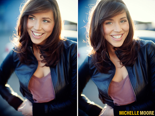
Lighting is super important for these kinds of shots because you’ll want to see the eyes and have enough light reflecting so they have that sparkle. Open-shade, a reflector, etc. is also good. Just make sure you check to see the eyes aren’t dull and lifeless. Having good lighting will take this composition from dull and flat – to bursting with emotion.
Creating Tension & Angles
Creating an interesting image has a lot to do with your angles, and the different dimensions or layers you create. You want to give somewhere for the viewer to look, or follow through the frame, without getting lost. If there are too many distracting elements that are not working in harmony, there will be nothing interesting for your viewer to grab on to. Annie Leibovitz is a photographer famous for her composition, and use of creating triangles in her images.
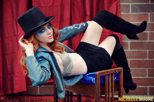
Move around your subject, try different angles. What compliments your subject? What works with their pose, and the mood? Is everything balanced?
Are there enough layers to create a visual interest? I find that when shooting with a wider angle lens, I have to create a lower perspective so there is enough visual weight to the bottom of the frame. There is nothing worse than a disappearing horizon below your subject.
You’ll want to make sure there is enough weight below your subject, and no distracting elements – like trees coming out of the top of their heads, etc.
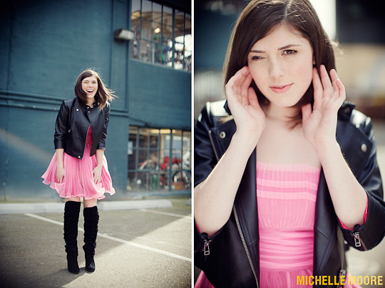
Be sure to check your lighting too, as this plays an integral part of creating tension. Is the subject facing the sun? How are the shadows? If the light is even and dull, how can you create interesting movement within your frame to tell your story?
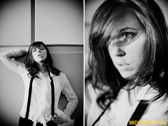
Symmetry
This is one of my favorites!
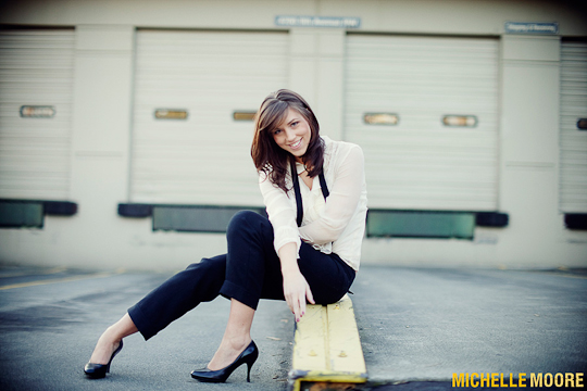
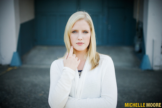
Nothing beats a killer dead-center composition with an awesome subject. Any basic composition book or class will teach you that framing something in the center is bad, but the key is doing it right, and with the right intentions. Framing something in the center screams confidence, and you’ll want your subject to have a killer expression, or interesting pose, or else there is nothing to give the image visual interest.
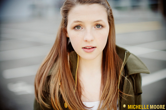
Symmetry is a good place to play with shadows, or lighting. Create visual excitement by playing with your lighting, and giving the viewer something to look at. Lead them through the frame with light and dark space, shadows, or some nice sun flare. Above all else, just remember that when framing a subject front and center, you have to make up for the lack of interesting composition by creating tension in the subject, and/or with your lighting.
Wrapping Up
In conclusion, it’s important to take away a few key elements from this article. The first being: study good photography, and two: know your basics – before you start breaking all the rules.
Practicing, learning, and getting a feel for what works and what doesn’t takes time, but with dedication to your craft (and a soft spot for reading/learning), you’ll get there in no time!
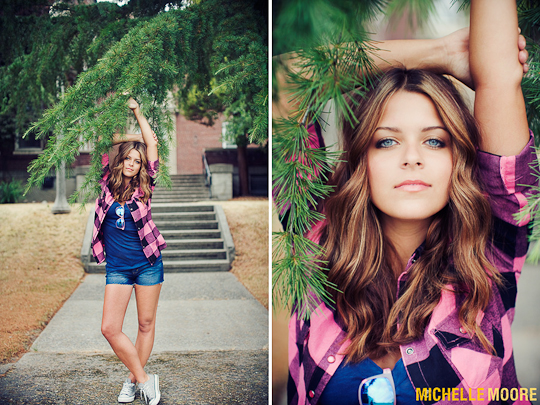
Thanks for sticking with us!
I hope that you have learned a few things about our modern take on the classics of composition in Photography!
