Everyone has encountered shots that have been over or under exposed before. Be it accidental or the result of bracketing, there are always a few less than ideal exposures in any project. Fixing each of the images can be time consuming, but if you leverage some tricks in Lightroom, you can speed up your workflow drastically.
Open up a poorly Exposed image in the Lightroom develop module. For this article we will be working on this image.
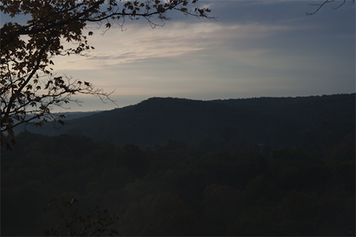
Once you have selected the image you wish to fix, the first step is to adjust the Exposure. Normally you would simply adjust the image until it appeals to the eye or fills the histogram in a proper way. However both those method take more time. Start by holding down your ALT/Option key on the keyboard and then click on the Exposure slider. The preview will turn either mostly or completely black.

Our preview window is black, with no signs of white in the preview. So, start adjusting by moving the Exposure to the right, increasing the exposure. Keep going until you see white start to appear.
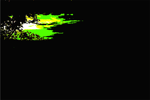
After you get the whites to pop out, simply back off the Exposure there is just some white still showing. Now the Exposure is more or less properly set. The areas of white in the preview are blown highlights, but the little white you leave will be removed in the next step.
Please note, if there are blown specular highlights in your image, they will show up in your preview. If you know those whites are from completely blow out areas, simply ignore those white spots. Work the Exposure until you get new whites appearing in the ALT/Option preview.
Now we want to get rid of the white areas that you see in the Exposure preview. As the white areas in the preview denote blown highlights. You normally will have a few small areas left in the preview, which means you created some highlight clipping while adjusting the Exposure. This is best removed by using Recovery as opposed to reducing Exposure, as you want your histogram filled.
Holding ALT/Option again, click on the Recovery slider and look at your preview window. It should look identical to the final result of your Exposure manipulation.

Now move your Recovery slider to the right slowly, until the whites just disappears. If the image has specular highlight clipping, you may have to go easy and leave those white areas, but normally you want to reduce the preview back to black.

Using the Recovery tool in this manner allows you to push the highlights of your image back down without altering the image histogram drastically. By just applying Recovery until the whites disappear, you will be rescuing blown highlights without applying too much recovery, leaving a natural looking image still.
Now that the Exposure and Recovery levels are set we will now pay attention to the shadows of the image.
Now you need to hold ALT/Option and start to adjust the Blacks slider. As you click on the Blacks slider the preview will turn white. Usually you will see some straggling black and color in the preview, but usually no more than a few lines and dots.

So now adjust the Blacks to the right until you start to see a light outline of the contents of you image. This will darken the shadow areas of you image while leaving the rest of the image alone.
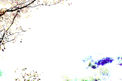
If you want less shadow, go with a faint outline of your subject. Increase the Blacks until you get a heavy outline if you want pronounce, dark shadows. After you complete this step, the quick adjustment process is almost done.
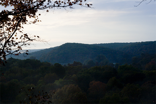
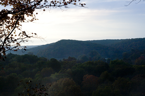
Now, as you can see, the final result seems a bit dark. The final step of the quick adjustment process is to adjust Brightness until the image looks good. In this example Brightness needs to be increased slightly. Now the image is done with its initial rescue.
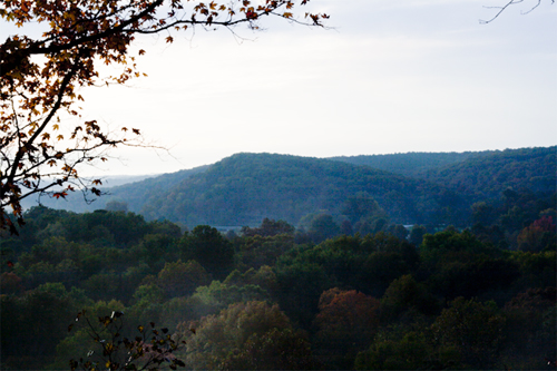
Reading this, it may seem that the process is rather long, but in reality it is simply four quick adjustments that take mere seconds to apply. Doing this to over and under exposed images in your catalog will quickly bring the images to a good starting point for further work and take little time to do so.
Now allow me to quickly step aside and talk about an area of confusion in Lightroom.
In this quick adjustment workflow, we utilize both Exposure and Brightness. In the comments of last Tuesday’s post a comment was left asking to explain the difference(s) between Exposure and Brightness; I felt this should be addressed since both are integral to this procedure.
From what I can gather, the difference is in how the two alter the image, although to the eye they seem quite similar. Exposure in Lightroom is essentially a form of exposure compensation. It simulates the effect of gain applied to the camera sensor. If you adjust your Exposure to +1, you are essentially using Lightroom to increase your images effective ISO by a full stop. Increasing Exposure to +1 on an ISO 200 image alters exposure to make it appear as if it was shot at ISO 400.
When adjusting Exposure Lightroom is increasing the response of the pixels across the image. The model for this increase is the same as increasing the voltage to a camera sensor to increase its sensitivity. Increasing the voltage to improve sensitivity is a real world application of Gain, and Exposure attempts to simulate this effect.
Brightness, on the other hand is essentially a form of Gamma Correction, much like adjusting Gamma in Photoshop. Increasing Gamma makes an image lighter in general and Brightness in Lightroom does essentially the same job.
Now, it appears that the two do the same thing, but watching the histogram in Lightroom while applying the different tools you can see minor differences in the effect on the histogram. Some images make the difference more apparent than others, but there is a difference between the two approaches.
Hopefully that explanation makes some amount of sense to you, but if not feel free to discuss in the comments. For now, try out the quick adjustment workflow we discussed today if you have not already discovered it on your own before.
