Contextual Presets Rock!
In this post, we’ll be creating what we like to call a contextual preset – a preset that is used in a particular context to enhance your image based on lighting, weather, time of day, season, etc.
This particular type of preset is no different technically than any other preset in Lightroom, with the exception that we would leverage these types of presets when we want to enhance an image taken in a particular context (ie. mid-day, sunny, wintertime).
After countless hours working with and creating presets, we take a step back to approach applying a preset based on enhancing (subjectively) the mood of an image not only based on the film, color, or tonal characteristics (such as with our Professional Film Emulation Presets) – but also based on context.
I shoot outdoors almost exclusively, and it is with this in mind that we’ll go through this exercise outlining how your workflow can evolve beyond thinking of presets as purely technical, or a means to an end, but something subjective and contextual – which you can memorialize as a reusable Preset for future projects.
With children, you have to shoot fast, low, and quickly … and fast. Did I say fast?
Before we go any further, let me share some details about this shoot …
Just as I was preparing to take these shots, a nasty thunderstorm swept in and about 5 minutes later the lightning and rain took over. The available light drastically dimmed and flattened out – the mood of the day, and my shoot, changed in a matter of seconds.
My response: SHOOT LIKE CRAZY.
With children, you have to shoot fast, low, and quickly … and fast. Did I say fast?
Kids don’t wait for anything, or anyone! That being said, afterward I had a great batch of images in front of me and it was the mood of the day and the storm that I wanted to bring out in these images.
We’ll start with the final image series:
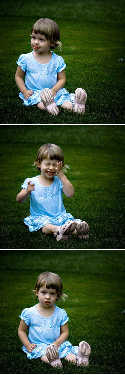
Now … let’s get to work
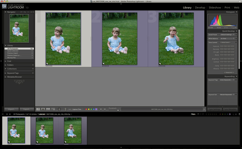
Here’s our original series of images, directly from the camera:
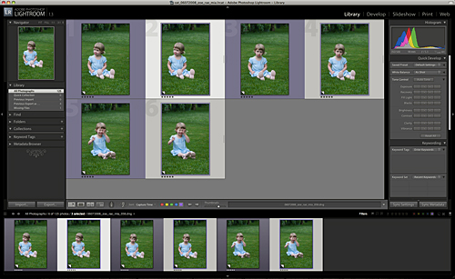
Next we’ll create some virtual copies Ctrl+’ (PC) or Cmd+’ (Mac) of our selection(s):
Now, let’s drill in on the first image in our series where we’ll do the bulk our our adjustments:
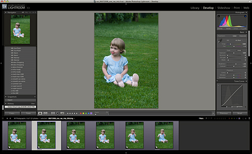
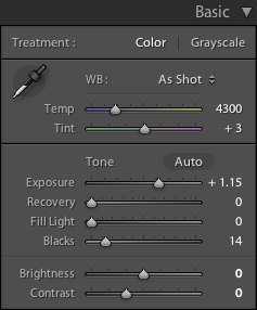
We’ll make the following Basic adjustments in the Develop Module:
- Exposure: +1.15
- Blacks: 14
- Brightness: 0
- Contrast: 0
As we can see, we’ve taken some of the flatness out of the image:
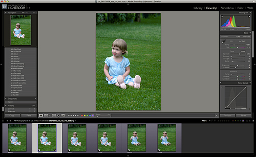
Next, we’ll make the following Tone Curve adjustments in the Develop Module:
- Highlights: +60
- Lights: +10
- Darks: -20
- Shadows -60
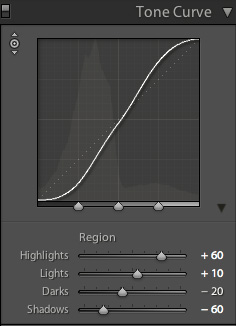
Now we’re cooking! Nice and punchy … just the way we like it.
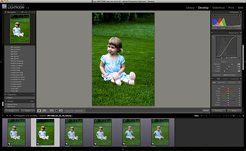
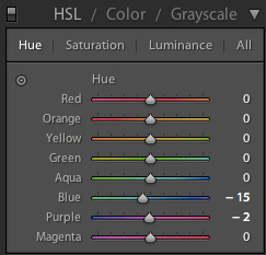
Let’s punch up the blues/purples in the dress as well. We’ll approach this with the Targeted Adjustment Tool (TAT) in the HSL panel.
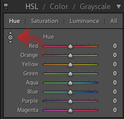
And by selecting directly on her dress and mouse-dragging UP, we’ll punch up the color just as expected:
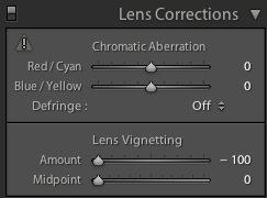
Vignetting, vignetting, vignetting … I am addicted if not obsessed with Vignetting. And we’re going to get extreme with it right … now:
We’re essentially done with our post-processing. Here’s where we stand in our workflow:
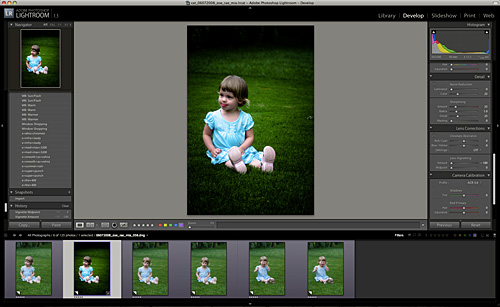
Next let’s sync our work across the remaining images, and save our adjustments as a preset:
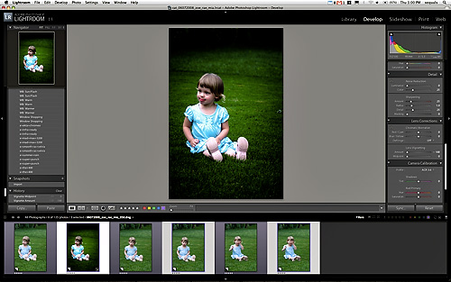
With our current image selected, select the other images you wish to target with your adjustments. Once selected, we’ll choose the following options in the Sync dialog box:
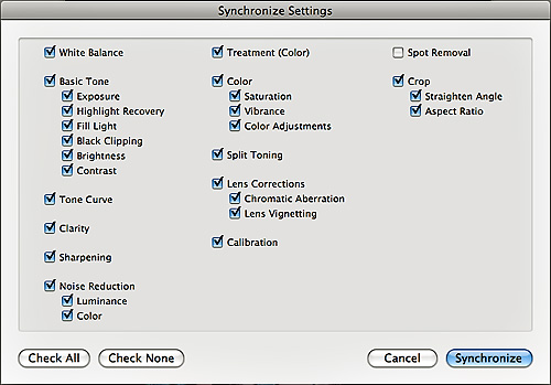
And … done.
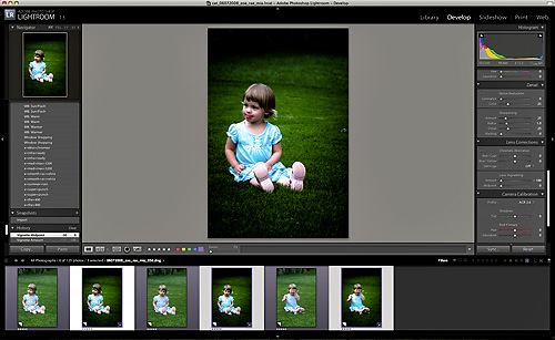
While in the Develop Module, pressing Y (Mac or PC) will toggle some quick before-and-after previews:
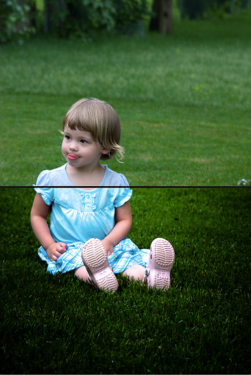
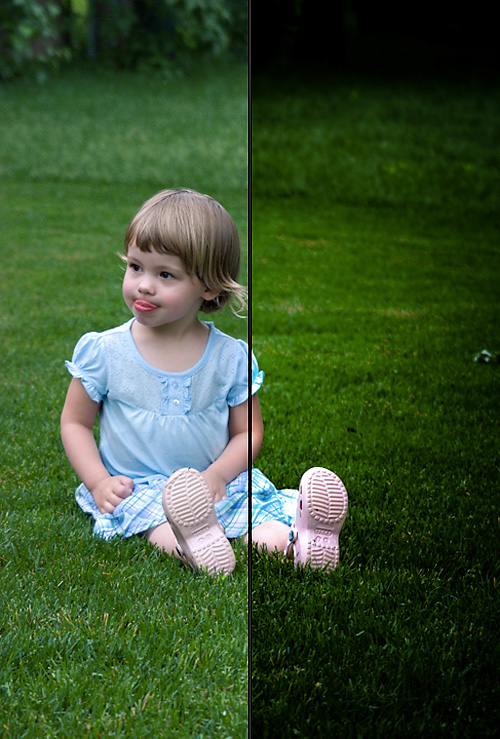
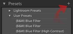
If we like what we see (I sure do) … let’s export our adjustments as a handy preset we can apply in the future to other jobs, etc. We’ll simply select the + on the Presets panel:
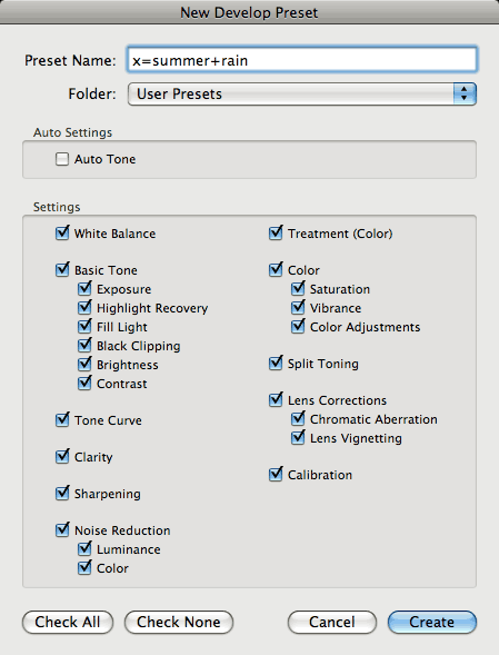
… and name our preset:
Which will live under the User Presets section of the Presets panel:
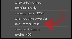
I always elect to store my presets with my catalogs for quick access as well.
Lately I have been cropping everything square. so let’s set a 1×1 crop. And we’ll do this across all images with our Auto Sync trick.
First, I’ll select all the images I want to crop, then hold down the Ctrl key on PC or Command key on Mac and select Auto Sync:
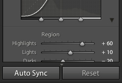
… and simply crop our first image to 1×1:
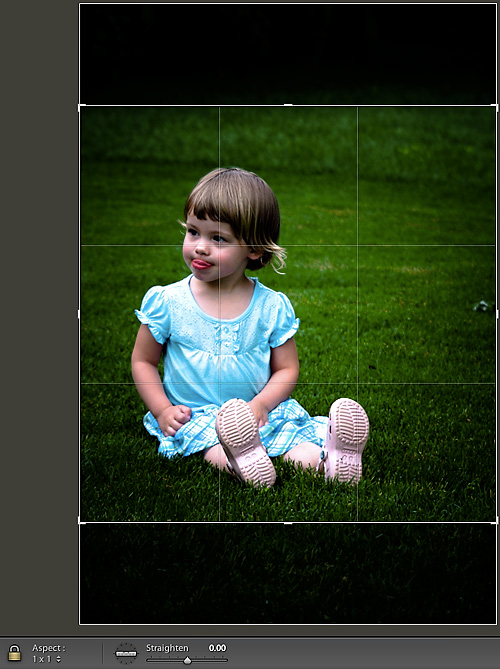
Once all my adjustments are complete, I hold down the Ctrl key on PC or Command key on Mac and select to set things back to the plain old Sync mode we see as the Lightroom default. All our adjustments have been applied dynamically to our entire selection. The possibilities are endless with Auto Sync. You can auto sync not only develop panel adjustment … but even spot removal!
That’s it, we’re done. Here’s our completed Lightroom catalog:
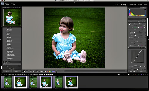
I hope this has been a good experience for you dear reader, as I am excited about the possibilities of using this preset on other images to give them that stormy – summer rain look!
Summer Rain is included in the XEQUALS Bundle.
