One of Lightroom’s lesser used features is the Slideshow module. If you’re like the vast majority of Lightroom users, you probably spend most of your time in the Library and Develop modules, perhaps occasionally going into the Print module.
The Slideshow module is often overlooked which is a pity because it has a number of useful and nifty features that can enhance the presentation of your images. In this post, I’m going to go through the various panels and options to explain what they do and how they work.
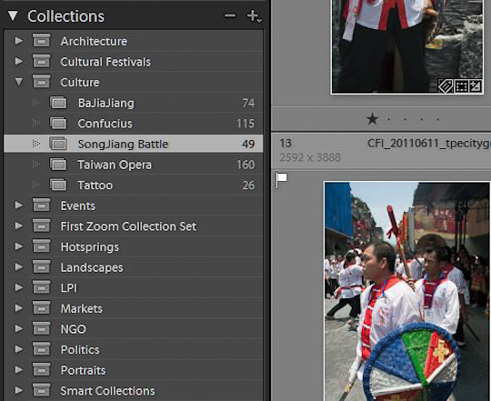
Before creating your slideshow, it’s necessary to organize the photographs you want to use. As you can see above, I have placed a series of images into a collection. These have already had the RAW edits done to them and are ready for output.
To create a collection, in the Library module select the photos you want and choose the Library > New Collection option from the pull down menu, or click the + icon in the Collections panel and choose Create Collection.
A further option is to select the photos you want and press B to place them in a Quick Collection, or make use of Smart Collections.
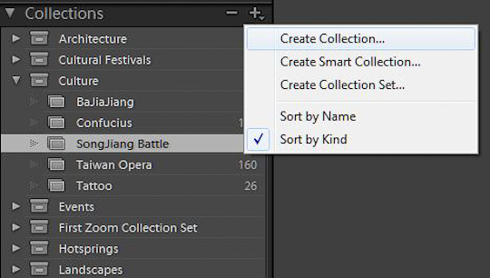
You may notice in screenshot 1 above that there are 49 photos listed as being in the Song Jiang Battle collection but my slideshow only has 14. I’ve further refined my selection by flagging the best ones in the collection. Now it’s time to head to the Slideshow module and below you can see it at its default view.
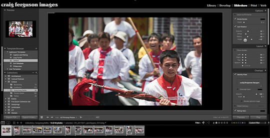
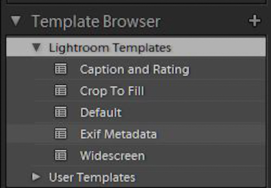
On the left you’ll see the template browser. Lightroom 3 has a few templates included – these are listed under Lightroom Templates or you can save your own under User Templates. The included options are for
Caption and Rating – This displays the photograph caption at the bottom and the star rating over the top left of the image.
Crop To Fill – This effectively zooms the image to completely fill the frame. Depending on the image proportions, it may also crop part of it.
Default – Does what it says by sending everything back to the default.
EXIF Metadata – Displays date and time the photo was taken, f stop, shutter speed, location etc.
Widescreen – Again, fairly self-explanatory. This prepares the slideshow for wide screen viewing formats.
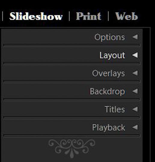
Most of the work you’ll probably do in preparing your slideshow in Lightroom will take place in the panels on the right. Whether you start from scratch or take one of the above templates and tweak it, the controls can be found to on the right hand side of your screen. Here you’ll find panels for Options, Layout, Overlays, Backdrop, Titles and Playback.
Options
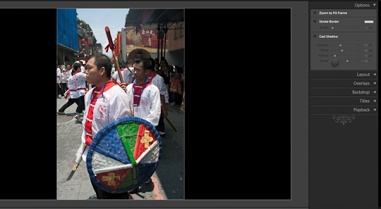
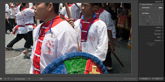
The options panel gives you three choices. Zoom to fill crops and zooms into the photograph to fill the slideshow window. Take a look at the screenshot below to see a before and after example of this control. I’ve used a vertically oriented image to best show the effect here, but I probably wouldn’t use zoom to fill on vertical images in actual production.
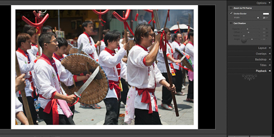
Stroke Border adds an inner stroke to the photograph. You can click on the color swatch to select different shades of gray or different colors. Below you can see I’ve elected to go with a white stroke border and again, I’ve exaggerated the effect to better demonstrate it.
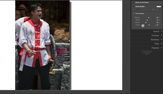
Cast Shadow lets you do just that. You’ll notice in the earlier screenshots here, I have a black background. As a result when I try to add a shadow, I can’t see anything. In this case, I have changed the background color to white which is done in the Backdrop panel. The options for shadow are set by moving the various sliders around to control Opacity, Offset, Radius and Angle.
Layout
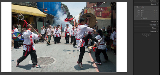
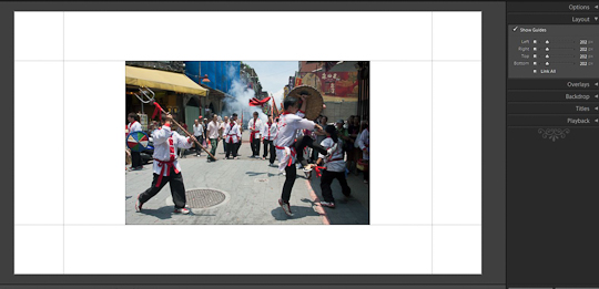
The layout panel lets you specify user guides on the margins at the sides as well as top and bottom. Adjusting these is setting the distance between the image and the outer edge of the slideshow window. It’s simplest to keep the Link All box checked if you adjust these. Here is the image with at 0px and at 202px for comparison.
Overlays
Continuing down the panels, next comes Overlays. The main choices here are whether to use your Identity Plate or to use a Watermark. The key difference between the two is placement – while an Identity Plate can be placed anywhere on either the image or background, a watermark can only be placed on the image.
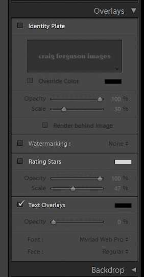
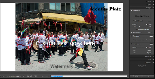
It makes most sense to use the above two options if you will regularly be using the same text, such as for a logo or copyright notice. If you have some custom text you want to add anywhere, or you are simply not interested in setting up identity plates and watermarks, Text Overlay is what you need. It’s not immediately obvious where it is – look for the letters ABC underneath the image and click on them to enter your custom text.
This can be placed anywhere on the screen. Below you can see a screenshot showing all three options.
Backdrop
Backdrop allows you a choice of different options – Color Wash, Background Image and Background Color. I mentioned background color above and you’ll notice I currently have it set to white.
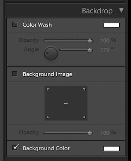
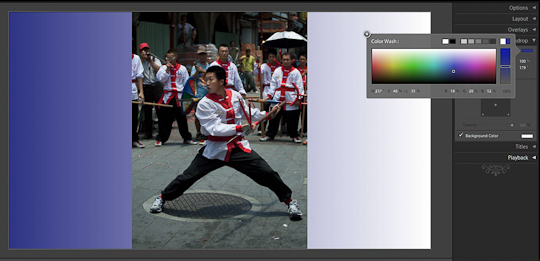
Color Wash is basically a gradient that can be applied behind the image. I’ve chosen a blue below for demonstration and there are options to adjust the opacity and the angle of the wash.
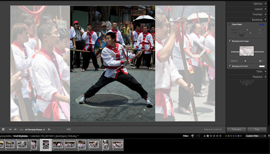
Background image allows you to place a photo behind the slideshow. When you check the box, it prompts you to drag a photo from the bottom filmstrip into the box. The is then laid behind your slideshow image. If you go for this option, you’ll almost certainly want to lower the opacity. I can see this being useful for wedding photographers, allowing the placement of a low opacity image behind the main window.
Titles
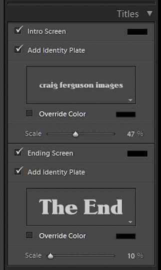
The Titles panel lets you create a beginning an ending screen using Identity Plates. You can use an identity plate that you already have or create a new one specifically for the beginning and ending screens. Note that you can use different identity plates for each.
Playback
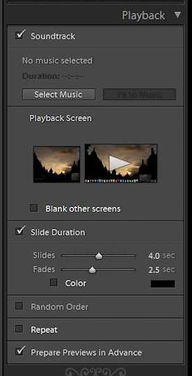
The final panel is for setting various playback controls. The first one is music – check this and you’ll be prompted to search for an mp3 file that will work as a soundtrack. This doesn’t mean choose your favorite song to go with your slideshow unless you are the only person who will see it – make sure you have a license to use any music you choose, particularly if you’re sharing it publicly.
Next is playtback screen with an option to blank other screens. I use a dual monitor setup and so have this option. If you only use a single monitor this will be of no concern to you.
Slide and fade duration times can be set, and you have the option to assign a random order or cause the slideshow to repeat. Finally, there’s a check box so you can let Lightroom prepare previews in advance.
Export
While it’s entirely possible to watch the slideshow within Lightroom, there are also a couple of export options. You can export it as either a PDF or as a video.
Export to PDF lets you set the quality and image size, with an option to automatically show full screen.
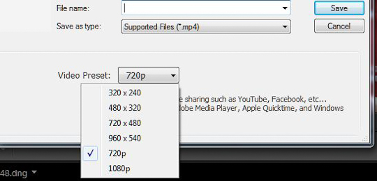
Export to video sends your slideshow out as an mp4 video file. You have options for resolution up to 1080p.
And here is a sample video output from this exercise via Youtube.
httpv://www.youtube.com/watch?v=eF4pNs-D4i8
So there you have it. Take some time to play around with the various controls and start creating your own slideshows.
Got a cool Slideshow tip/trick … let us know below!
