In Part 1 of Mastering HSL in Lightroom, we covered exactly what the HSL is and how it is used. If you spent some time experimenting with the Color Checker DNG we provided you should have some sense of how Hue, Saturation and Luminance interact with the different colors. If not, jump back to Part One and take a few minutes to review the basics of the HSL.
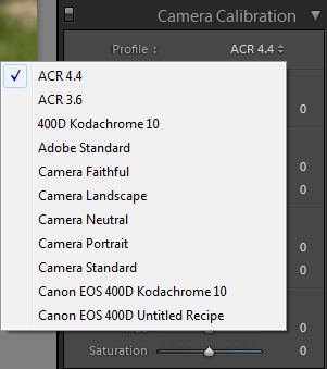
Before you start manipulating the HSL for any particular image, I recommend selecting a Camera Profile that gets your basic image into the range of colors you desire.
By starting with a profile that gets Lightroom’s default rendition more in line with your desires for the image, you will save time and effort when working with the HSL. Work through the profiles installed in your system and see if any of them render your image better than the others. The closer your starting point is to the desired goal, the less editing will be required and you run less of a risk of degrading quality by pushing any given color too far.
As we previously learned, the HSL is amazingly simple to use. On the other hand, the HSL is much like the game of Chess, easy to learn and hard to master. The effects of Hue, Saturation and Luminance upon colors in an image can be extreme and can easily destroy an image. It is best to use a light hand when making corrections.
The closer your starting point is to the desired goal, the less editing will be required
The most basic method of adjusting the HSL is simply moving the sliders you want to alter, however it is easy to adversely affect an image when simply moving sliders. The best method to start adjusting color in an image is to use the Targeted Adjustment method. This method allows you to directly click on an area of color in your image and adjust the color merely by dragging the cursor.
The Targeted Adjustment method can only be used in the HSL tool, not in the Color tool, as you can alter more than one color at the same time. Also, you can adjust only one variable at a time with this method. Each set of sliders allows for Targeted Adjustment, but let’s see an example using Saturation.
First, bring up the HSL panel in the right hand menu in the Develop Module. Now we will head over to the Saturation sliders and look for the Targeted Adjustment tooltip to the left of the sliders.
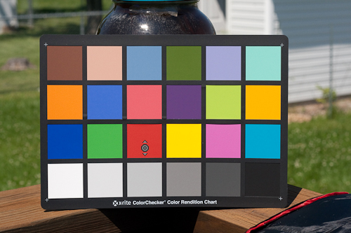
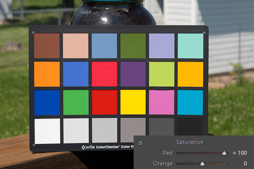
Now click on the Targeted Adjustment tooltip. You will notice your cursor becomes a crosshair with the tooltip next to it, as denoted by the small circle with arrows above and below it. We are going to use the Color Checker image once again to demonstrate this tool.
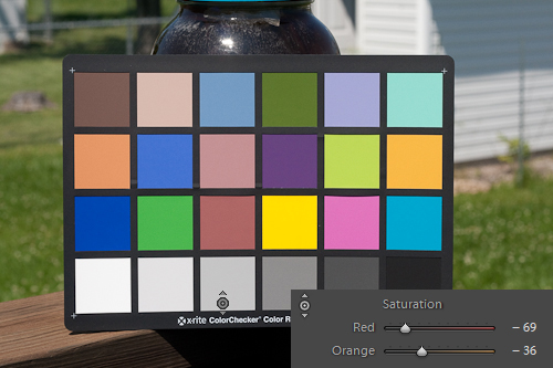
Now, let’s click inside the lower Red patch and hold down the mouse button. Slowly start dragging the cursor down to decrease Saturation.
While dragging take some time to look over at the HSL Saturation sliders. You should notice that not only the Red slider is dropping, but the Orange as well. This tells us that this particular shade of Red has a large amount of Orange in it as well.
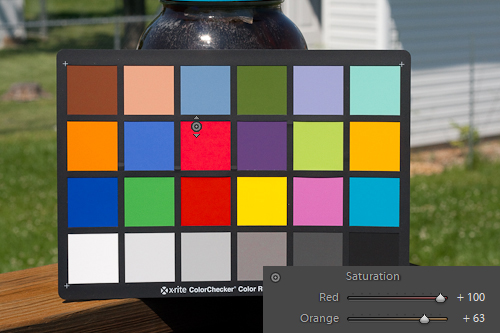
Now let us change directions and move the mouse upwards, increasing Saturation. We will take the Saturation on the Red channel into the +90’s range. Notice that the Orange slider is increasing at about the same rate.
Now, click on the Targeted Adjustment tooltip in the HSL again to turn off the tooltip. Now lower the Orange Saturation back to 0.
Notice how the richness of the Red patches slightly drops when removing the Orange Saturation? This is an important observation to take note of. When you are making a drastic adjustment to any particular color channel using Hue, Saturation or Luminance you will normally want to adjust the neighboring colors some to ensure good tone and transition between colors.
Luckily, when using the Targeted Adjustment tool, Lightroom will give you an indication of which colors to adjust, as Lightroom will adjust them for you. That is not to say that Lightroom’s HSL settings are right, there is always room for improvement, but Targeted Adjustments will give you a good indication of what tweaks to make.
Take some time and work with the Targeted Adjustment tool using the Color Checker DNG we provided in part one. As you adjust different color patches, watch how the sliders react back in the HSL panel. Watch how the alteration to the patch you are manipulating affects other color patches. To really make HSL alterations you need to have a feel for how the Hue, Saturation and Luminance sliders interact together and with color to get desired results.
Once you have a feel how the colors react to the Targeted Adjustment tool, you are prepared to directly manipulate colors on your own. However, you should still used the Targeted Adjustment tool frequently to verify which colors need to be altered. A color may look dark Blue to your eyes on your monitor, but it may have a level of Purple in it, requiring Purple to be adjusted as well as Blue to generate your desired result.
So, let us look at some sample images that can be improved by utilizing adjustments to the HSL.
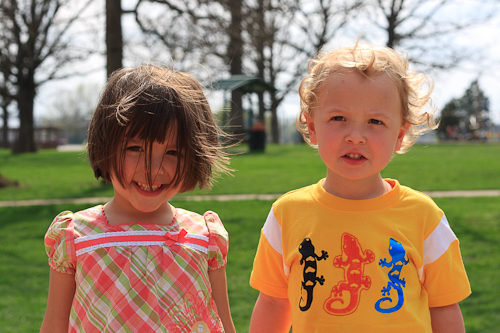
For our first case, let’s look at an outdoor portrait. This image has already been altered by the use of a Landscape Camera Profile to bring some pop to the grass in the background.
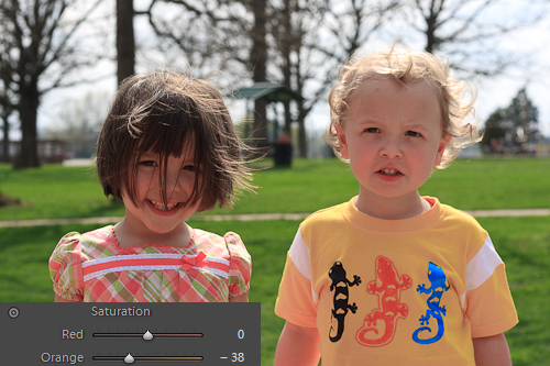
As you can see, the Camera Profile added the needed zing for the grass, but had the side effect of making the skin tones an undesirable Red/Orange shade. The easiest fix for Red skin tones is to lower the Saturation in the HSL for Orange. We will drop the Orange Saturation to (-38).
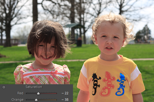
The skin tone is looking better, but a blotchy red is now apparent. To lessen this effect we will drop the Red Saturation down to (-22), just over halfway from 0 and the Orange setting.
As you can see, the Red blush has been mostly removed, and the only noticeable damage to the image is the loss of the Yellow/Orange tone of the boy’s shirt. Usually, this could be tolerated, but to show a quick way to compensate, we will boost the Yellow Saturation to (10) and shift the Yellow Hue towards Orange (-59).
Now, the image has a more neutral skin tone for both subjects, a vivid lawn behind them and the boy’s t-shirt has had some of the Orange hue that was destroyed in fixing skin tone revived with a Hue shift in the Yellow channel.
As you can see, the colors all have to be worked together, and to get desired results you will often have to utilize more than one HSL component.
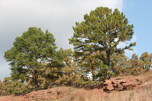
Sometimes, you can do a lot with just one HSL component. Luminance can be utilized to enhance weak Blues in skies and bodies of water. Consider this example.
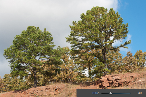
The Blues in the sky are pretty weak in this image, and it would be nice to put some punch back into them, as if using a circular polarizer. One simple adjustment of (-40) to the Blue Luminance garners us this improvement.
That is much better. It looks good with just the Blue adjusted, but if you are darkening skies and start to see a banding as the sky shifts to a lighter shade, you should try dropping Aqua a bit as well. As mentioned before, you always want to do a moderate adjustment to neighboring colors if you start to notice image deterioration.
To get desired results you will often have to utilize more than one HSL component.
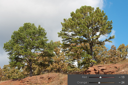
While we are fixing up this image, let us finish it off using just the HSL. The clay in the foreground looks just a bit drab still. For this fix, we will use Hue, Saturation and Luminance. First we will drop the Orange Luminance to (-24) and drop the Red Luminance to (-13).
Both colors were adjusted as both are quite prevalent in the clay outcropping, Red to a lesser extent than Orange, so I best guessed it at (-10) and then backed up a bit to (-13) to get a pleasing appearance. Now the clay needs a bit of pop, so increase Orange Saturation to (+30).
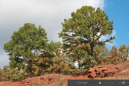
Finally, that clay is just to pale, even after the Saturation boost. Clay should really have more red in it, so let us adjust the Orange Hue down to (-20), shifting the Orange in the image ever so slightly towards Red.
That final tweak gave the clay a nice, rich earthy red tone and helped with the fall foliage that was starting to turn at the time the image was taken. That completes a series of subtle, yet effective adjustments that made this image better, using nothing more than the HSL panel.
Hopefully these past two samples give you an idea of what can be done with the HSL. However, to get effective at the use of the HSL you really have to be comfortable and cognizant of the relations between colors and the different components of the HSL. Again, the best way I have found to wire your brain for color shifts is to play around with a Color Checker image in Lightroom.
Practice with what we have worked with today, correcting simple color errors and making subtle changes to increase an images appeal. If you want to take things further, over the top even, head on over to Part 3, where we will looks at some of the outside the box uses for the HSL panel.
