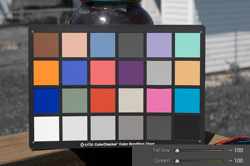
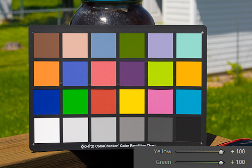
Color – it’s the first aspect of a photograph most viewers ever notice. Colors bring an image to life, and mastering the color rendition of your image is of the utmost importance. Enter Lightroom’s HSL Panel.
Adobe provides camera profiles for major cameras to ensure colors match your camera’s LCD display. The DNG Profile Editor is also available to make custom color profiles to help guarantee accurate color reproduction in Lightroom.
DNG profiles ensure accurate colors but don’t aid much in creative color rendition. We cover camera profiles in our Playing with Color – Camera Profiles series.
Color Me Saturated
Lightroom allows even more fine grain control over colors than what the DNG profiles allow. HSL stands for Hue, Saturation and Luminance. The tool allows you to control the levels for each of these variables to the Lightroom color palette.
Lightroom’s HSL allows control of eight general colors, beyond the scope of many other imaging applications. The HSL allows alteration of the additive colors; Red, Green and Blue along with the subtractive colors; Aqua (Cyan), Magenta and Yellow. Beyond the sacred six, Lightroom also allows direct adjustments to Orange and Purple.
The selection of adjustable colors diverges from the standard additive (RGB) and subtractive (CMY) color processes. The colors selected for the HSL are the colors that photographers most often want to adjust. This system makes it easier to perfect the color rendition of your image.
Hue, Saturation and Luminance can be individually adjusted for each of these colors. This approach permits a vast array of renditions for individual colors and their composite colors. This color control enables unique images with high creative and realistic potential.. The level of control the HSL tool endows us with allows for many possibilities.
Today, we’ll overview the HSL/Color/Grayscale panel in the Develop Module, concentrating on the HSL tool. In part two, we’ll explore techniques using the HSL to enhance your photos. And part three will delve into advanced methods to maximize this tool’s potential to improve your images. We will also look at some more advanced techniques for getting even more out of this versatile tool.
Let’s jump right to the develop module to take an in-depth look at the HSL tool. For the sake of visualization, all screen shots will feature an image of an X-Rite Color Checker.
If you would like to play along with the Color Checker but don’t have one, grab mine below. The color patches really make it easy to get a firm grasp on the adjustments.
The HSL/Color/Grayscale panel is actually divided up into three separate tools. The HSL tool provides an interface to control the Hue, Saturation and Luminance of all eight colors simultaneously. The Color tool allows you to focus on one color at a time, adjusting its Hue, Saturation and Luminance without the other colors cluttering up your panel. The Grayscale tool contains the Grayscale Mixer, and is covered in-depth in our Monochrome Mojo series.
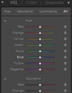
So let’s start by looking at the full blown HSL tool. Before we finish today, we will take a quick glance at the Color tool. In the develop module, head on over to the right menu and scroll down to the HSL/Color/Grayscale. Make sure to select HSL. A panel that looks like this should appear before you.
Hue You Doin’?
The first set of sliders that you will be presented with is the Hue sliders. Look at the slider and you will notice a gradient of color, which depicts the range you can adjust your Hue. Look in particular at the Orange slider.
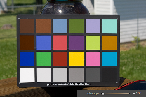
Notice that the left side of the slider gradient is Red, whilst the right side is Yellow. You can alter the Hue value for Orange from completely Red (-100) to completely Yellow (+100) while true Orange is in the middle (0).
If you look at the Hue sliders as a whole, you will notice that any given color can be shifted to the color above it (-100) and the color below it (+100).
Red and Magenta are linked as well, although Red is on top whilst Magenta is on the bottom. These two colors complete the circle, just as if Red was below Magenta and Magenta above Red.
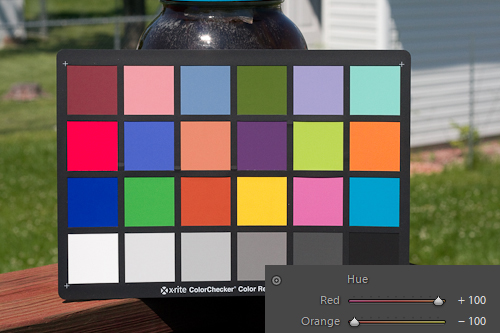
If you are so inclined, you can even set Red’s Hue to (100). This makes Red essentially Orange and set Orange to (-100) making it Red, flipping the two color channels. In reality this is of little use to do, but the point is it can be done.
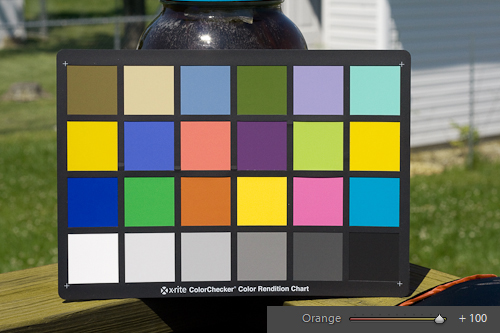
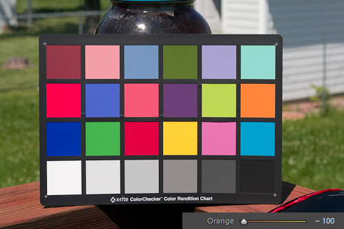
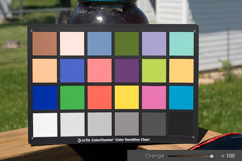
To demonstrate, look at the Orange patch in the series of images below. We will shift the Hue of the Orange channel from (+100) to (0) and then to (-100) and watch the shift in hue as we progress through the series. Also notice how other color patches shift, such as Brown, which contain a level of Orange in their composition.
A great use for the Hue sliders is to adjust Red, Orange and Yellow in fall landscapes. To enhance browns, oranges, and yellows in a shot lacking a good balance of reds and yellows, you can adjust the Hue slider for those specific channels.
Saturation Complete
Next up is the Saturation sliders. Saturation is essentially the richness of any given color. As Saturation approaches the left of the slider, that particular color channel becomes devoid of color, leading to a gray tone at (-100).
As Saturation approaches the right, the color becomes richer, culminating in an almost unreal interpretation of the color at (+100).
Saturation is one of the most powerful tools in the HSL as it can remove a particular color channel or pop the color completely. If you use the global Saturation slider from the Basic Tone tab to boost the overall image color, you can use HSL Saturation to back off on any given channel, taming the saturation for that on tone.
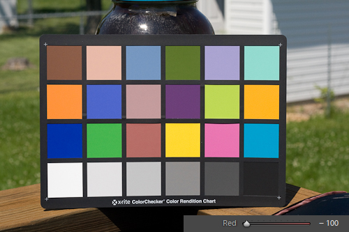
To further demonstrate the effects of Saturation on an image, watch the Red patches in the series of color chart images below. Again starting with (+100) then (0) and ending with (-100). Notice how the richness of the color patches fade, and look out for other color patches that are affected by the Red Saturation.
An example is if you have an environmental portrait outdoors. You want a lot of saturation to make the scene come alive, but raising the global Saturation causes the skin tones to get funky.
You can lower the Orange Saturation in the HSL to reign in the skin tones back to acceptable level, making the subject look normal while the rest of the image is saturated.
Don’t Forget Your Luminance
Luminance is the final component of the HSL, and it affects the relative brightness of each color channel. As you adjust a color’s Luminance slider to the left, the brightness drops, darkening the rendition of the color at (-100).
As you move the same slider to the right, the brightness of the color channel increases, brightening the color rendition at (+100).
What is important to remember here is that HSL Luminance is a lightening of the impact of a particular color channel. When applying a Luminance change in the HSL, it is smart to adjust the surrounding channels a bit to ensure smooth transitions.
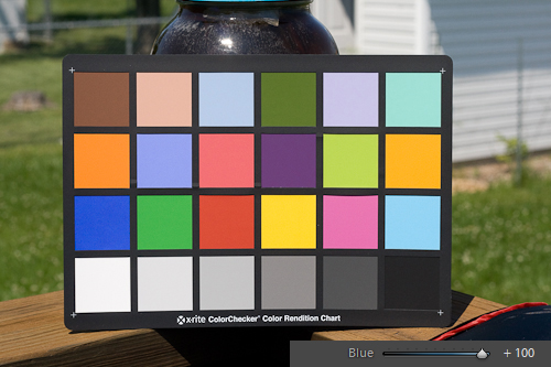
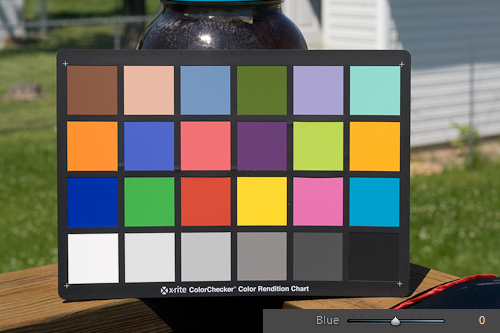
Luminance adjustments are most common in the Blue channel, as lowering the HSL Luminance allows you to darken the blue in the sky, much like a polarizer. Watch the Blue patches in the color checker in the following images as we again run through a (+100), (0), (-100) progression.
Notice how the patches with an element of Blue to them darken as we lower the HSL Luminance for the Blue channel. As mentioned, the Luminance slider is an excellent way to bring some pop into skies and bodies of water simply by darkening the effect of the Blue channel.
That’s a basic rundown of the tools available in the HSL panel. The HSL gives you control of all the color channels at one time. However, sometimes you may only need to adjust a single color channel. For this you can select the Color option from the HSL/Color/Grayscale panel.
When you select the Color panel, you are presented with these options.
As you can see, there is a selection bar at the top with all the available colors. Clicking on one brings the focus of the Color panel onto that particular color. Now you are presented with a Hue, Saturation, and a Luminance slider for just that color.
One Of The Best Tools In Lightroom
When you are only working on one color, this removes the clutter of the sliders available for the other colors. This comes in handy when adjusting the Orange channel to fix skin tones, or the Blue channel to enhance skies. Aside from eliminating the other color’s sliders, the Color panel sliders operate exactly like their counterparts in the HSL.
So, that is a general overview of the HSL and what it can do for you. In the next part of this series we will dig deeper into actually using the HSL, the ways you can interface with the HSL directly in your image and tips on how to get the best results. We will look at some tricks you can use to make you images unique.
In the mean time, take some time to get used to how the HSL. If you haven’t already, grab the DNG of the Color Checker, import it into Lightroom and play around with the different colors and how Hue, Saturation and Luminance effect the color patches in the image. Using the HSL well requires a feel for colors and how the different variables affect their rendition, and an image of a Color Checker provides the perfect canvas to perfect the art of color manipulation.
The more familiar you are with color manipulations before we move on in the series will allow you to get more out of the Parts 2 and 3.

