Split Toning in Lightroom is quite simply a real-life lesson in simple complexity. The tools is five, simple sliders that together create an effect over an entire image. Split Toning is amazingly simple to use, but using the Split Toning tools effectively can be surprisingly complex. Split Toning can be easily used to quickly and dramatically enhance an image. But care must be taken not to overdo it.
At first, Split Toning may seem to be a rather limited tool. After all, all it really does is produce a uniform color cast over an image’s highlights, shadows or both. Split Toning is a rather simple tool, and often is looked upon as a tool rarely needed in Lightroom. I am sure quite a few of you regularly use Split Toning and are cognizant of its use, while others may have never intentionally used Split Toning, but have seen its effects when applying presets provided by others.
There are countless ways to utilize Split Toning into your workflow, but I am going to show you three of the ways I use Split Toning in my workflow. But first, a quick overview of how to work with the tool.
Once you have an image selected and open in the Develop Module, scroll down the right tool bar to the Split Toning palette.
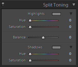
As you can see, the tool is broken down into five basic sliders. At the top is the Highlight portion of the tool, containing a Hue and a Saturation slider. Adjusting these two sliders will produce continuous color tone applied to the highlights and mid tones. The Hue slider is simply a color chooser, allowing you to select the shade you wish to apply to your image. The color selected will be shown in the small box next to the word Highlights. The Saturation slider allows you to control the intensity of the tone you have added.
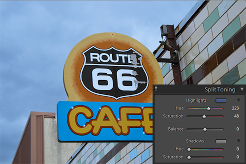
At the bottom of the palette, is the Shadow portion, again including a Hue and Saturation slider. When these two sliders are used in conjunction, they will operate identically to the Highlight sliders, with the exception that they affect shadows and mid tones, barely touching highlights.
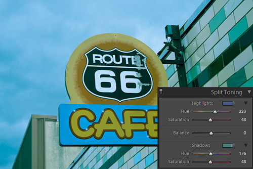
The fifth slider in the tool is simply called Balance, and it works just like the balance would on a stereo. Set in the middle, at 0, the tool makes the effect of the Highlight tone and Shadow tone equal in the image. As you shift the Balance slider to the right, Highlight tone is given priority over the Shadow tone. Moving it to the left accomplished the inverse, prioritizing the Shadow. When set to a value of -100, the Highlight settings are ignored; when the slider is set to 100 the Shadow settings are ignored.
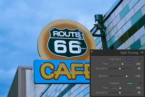
Simply put, that is all there is really needed to know to set out upon using the Split Toning palette. However to use it effectively takes patience, practice and an eye for color. The tool is so simple, yet balancing the effect of each slider rapidly becomes a complex proposition. People can create some stunning effects using those five, simple sliders, people more creative than I.
I take a more technical approach to Split Toning in my workflow. I primarily use split toning for three simple uses. Two of my uses simulate traditional photographic technique, while the third use is one I rarely see mentioned. Hopefully my Split toning methods will be of some interest to you.
Simulating Toning Monochrome Images
The first and most obvious use of Split Toning, in my opinion, is to create classic toning effects for monochrome images. In Lightroom, once you convert an image to monochrome, there are only two tools that can reintroduce color. First is the local adjustment tools (primarily the Adjustment Brush) and second is Split Toning.
By reintroducing color using the Split Toning, you can easily enhance highlight and shadow detail while strengthening the mid tones of you image. The effectively reproduces the toning effects used in traditional printing, such a Sepia toning.
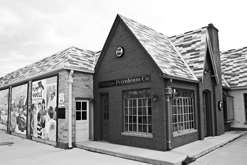
Toning monochrome images is easy to do and takes almost no time. For some images, this slight addition of color can really improve upon the standard monochrome conversion. Simply set your Highlight Hue to the color you wish to tone your image. Crank up the Highlight Saturation until you get the tone you are looking for.
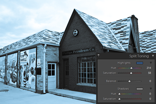
If the toning of the highlights is good enough for you, you can leave it at that, but often you need more depth in the shadows to further improve the toning effect. Carry out the same steps as you did for the highlight effect, using the shadow sliders. Make sure you set your Shadow Hue a little bit to the left or right of your highlight, at least one or two points more or less (try a difference of approx. 20), to differentiate the Highlight and Shadow hues. This will create more depth in your image. Also, vary your Shadow Saturation from the value used on the Highlight Saturation. Again, the variance will enhance depth.

Finally, simply move the Balance slider back and forth until you feel the balance between the Highlight Tone and the Shadow Tone is correct. This step is very subjective, but as you move the slider you will surely find the best blend of the two tones.
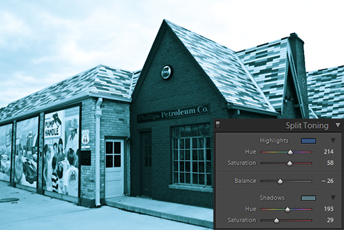
I recommend you to keep the two tones in the image fairly close together, as it lends well to recreating the classic toning effects. However do not feel compelled to experiment, as some more creative uses of toning over monochrome images can look stunning as well.
Getting that Cross-Processed, Lomo Look
Another great use for Split Toning is to get that over-blown, color casted fun of cross processed film. Now, not all cross processed film gets bad color shifts, but a lot of it does, especially when the image was not properly exposed, such as in a Holga.

To get the color-shift feeling, simply pick contrasting colors for the image’s Highlight and Shadow tones. I often start with red highlights and green shadows. Set the Hues for each to a moderate level, enough to be apparent but not enough to overpower the image.
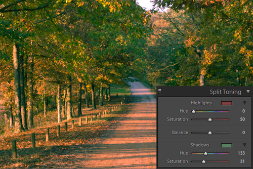
Now, adjust the Balance until the image feels right. It will take some playing with the Hue, Saturation and Balance to finesse you image into that lomo look, but Split Toning can help make it convincing.
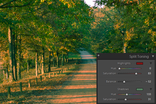
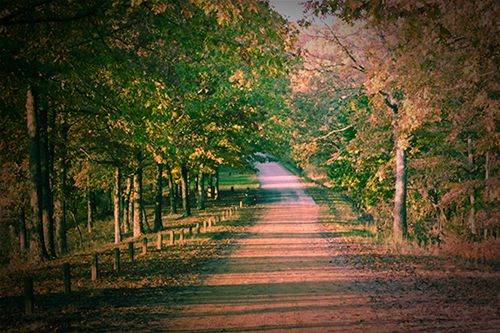
To really get the feel of a lomo shot, start out by treating your image with our Holga preset. After applying the Holga effect, then hit with some split toning to get your perfect lo-fi image.
Correcting Stubborn Color Casts
My final use for Split Toning is to get out stubborn color casts. Sometimes, when White Balance alone can’t remove a funky color in your image, or if you shot in JPEG for some odd reason, you need more color correcting power.
Now, this will not always work, but it helps me often enough it warrants mentioning. If you can identify the offending hue of your color shift in your image you can somewhat nullify it by applying a contrasting color tone to your image. This is especially true when working with film scans where the images may have an inherent color shift that.

So, start with a badly color shifted image. Start with your best guess as to what the opposing Hue to you image’s color cast is. Now set the Highlight Hue to your best guess and set the Highlight Saturation to 45-60.
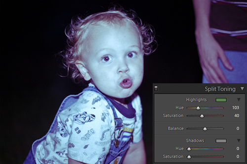
Now, slowly adjust the Highlight Hue until you definitely notice the color cast to be lessening in the highlights of your image. Then adjust the Highlight Saturation to set the right intensity to neutralize the image’s inherent cast.
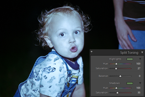
Once you have the Highlight settings figured out, simply duplicate them into the Shadow settings. This should complete the Color Correction.
As said, this is not really the best way to correct a color cast, but it often works when White Balance settings are letting you down. It is just another possible use to keep in mind.
So hopefully this opens you up to some ideas on how to use Split Toning in your workflow. There are surely many different ways that what has been presented here, but these are a good start. Experiment away and discover some tricks of your own.
