Color grading is one of those open ended subjects that is incredibly hard to perfect because of the seemingly endless amount of possibilities. With so many options it can be hard to know where to start! Many photographers have a hard time establishing a color palette and will simply resort to one of the popular blue/yellow or red/green combinations. Those craving a little more variety will inevitably resort to any number of actions or presets designed to run through a gamut of color combinations.
What if there was a method to establish your color palette that made more sense and was faster to boot?
So Where Do You Start?
Color grading can be used to establish a mood, but also to tie an image together through the clever use of color. My preferred method for color grading is through utilizing the dominant colors in the image. By using the dominant colors in the image as part of your color grading process you can make a more coherent image.
These colors will be present in the shadows and highlights; which will give those colors a sense of purpose and unity in the overall scene. The end result will be an image that looks more coherent because there is a consistent color scheme present throughout the photo.
The Process
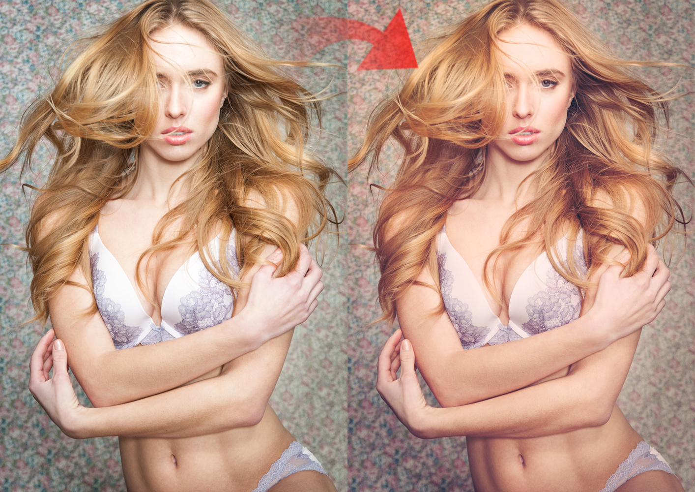
The first step is to identify the dominant colors in the image. We need to identify two of them. Every image will be different and that is what gives this technique its unique touch. Taking a peek at our original image, we can see that there are two prominent colors which were the focus of the image.
Due to the floral nature of the image, there are a lot of red and purple tones in the background pattern, and these same tones can be found in the make-up application. The other color at play is the yellow present in the hair.
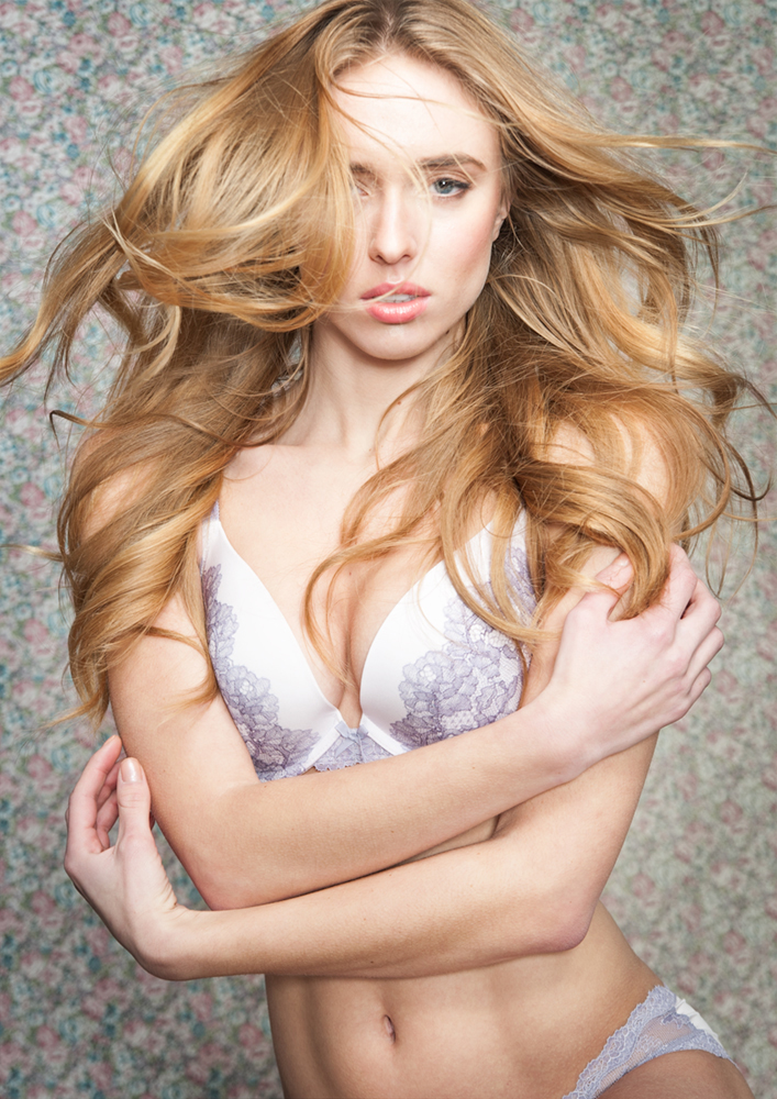
Now that we have our two colors identified they will serve as the colors which will fill our shadows and highlights. I generally prefer to use the warmer of the two colors in the highlights, and the cooler color in the shadows.
The next step will be to apply these two colors into our highlights and shadows. We will be doing this by creating two separate solid color adjustment layers and masking them for the highlights and shadows of the image.
Let’s begin with the highlights. I have decided to use some of the yellow color from the hair as part of the warm tone in my highlights. Lets take our eyedropper tool and sample one of the yellow tones in the hair:
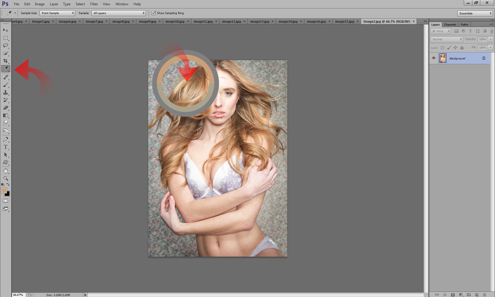
Once we have our sample, go into the Adjustments Menu, and create a solid color layer: this will place a solid color of our selected yellow sample over the entire image:
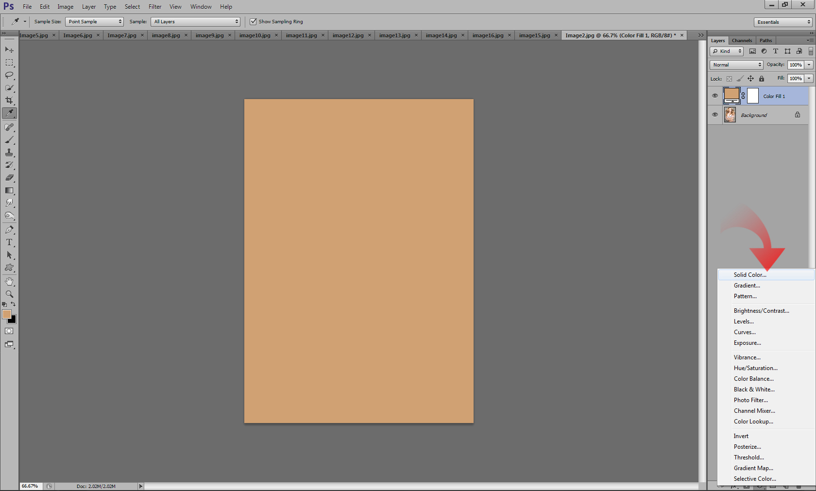
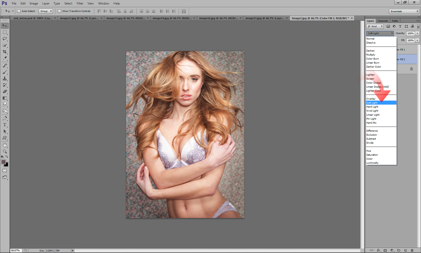
Now we need to change our Blend Mode to something a bit more appropriate. I usually opt for soft light because I find that it gives a more subdued effect and smoother transitions between the highlights and shadows. The hard light and color blend modes work as well, so try them out, and choose the one which best suits your image:
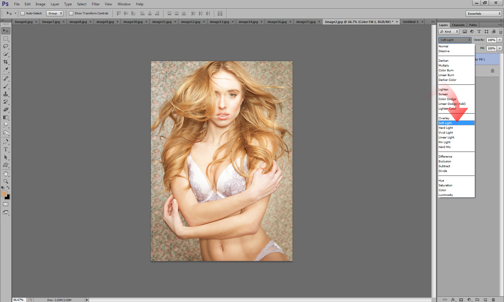
As you can see our current application is Global, meaning the color is applied all over the image. We want to isolate this color application strictly to the highlights, and there is a fairly simple method to doing this. First thing you want to do is make sure you are working with the mask for your solid color layer:
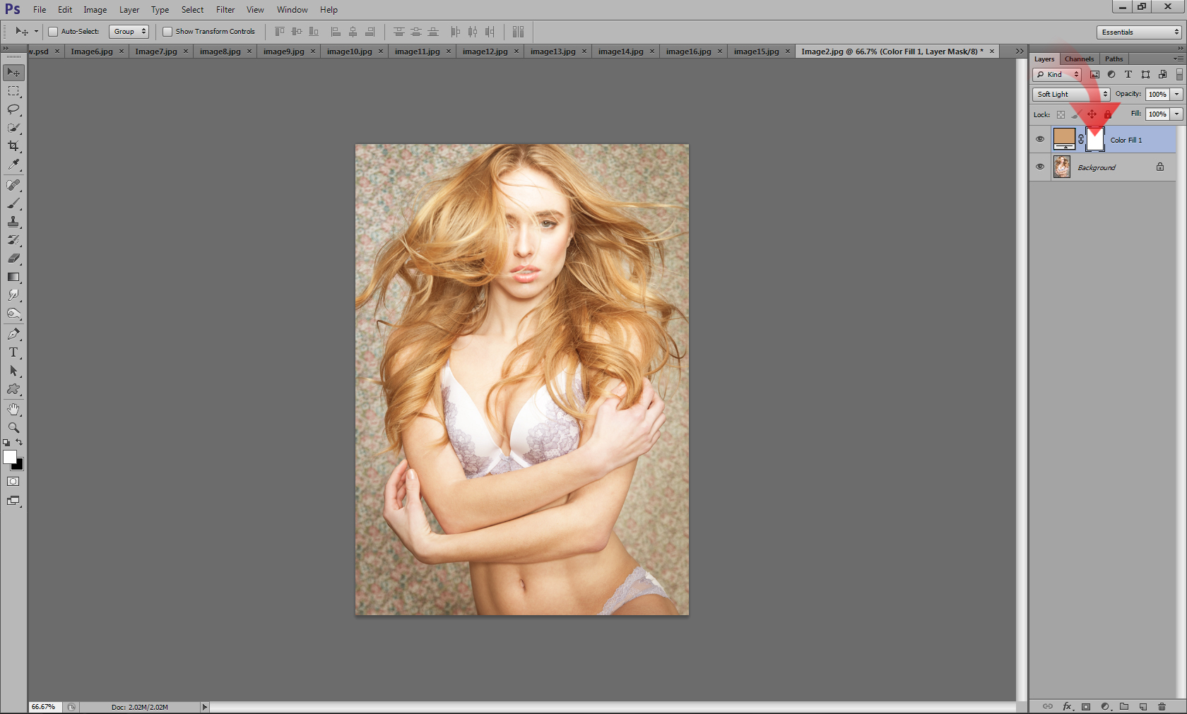
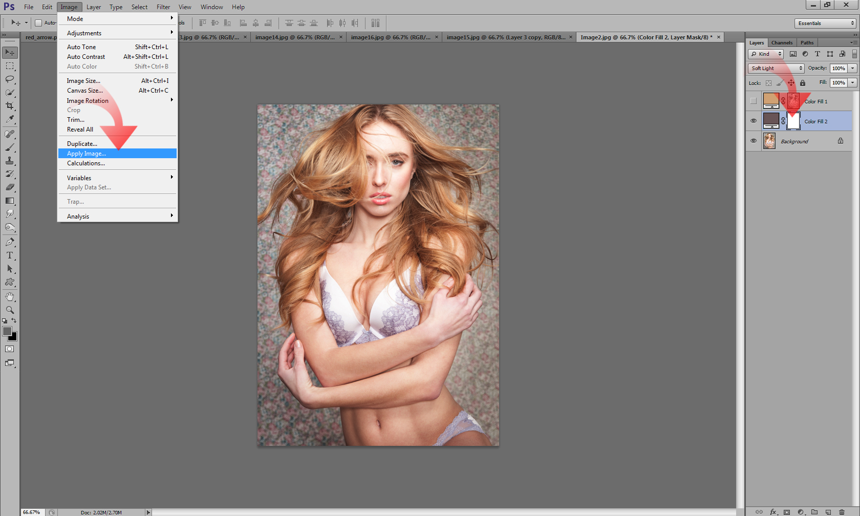
Once you have your mask selected, go into your Image Menu, and select the Apply Image option:
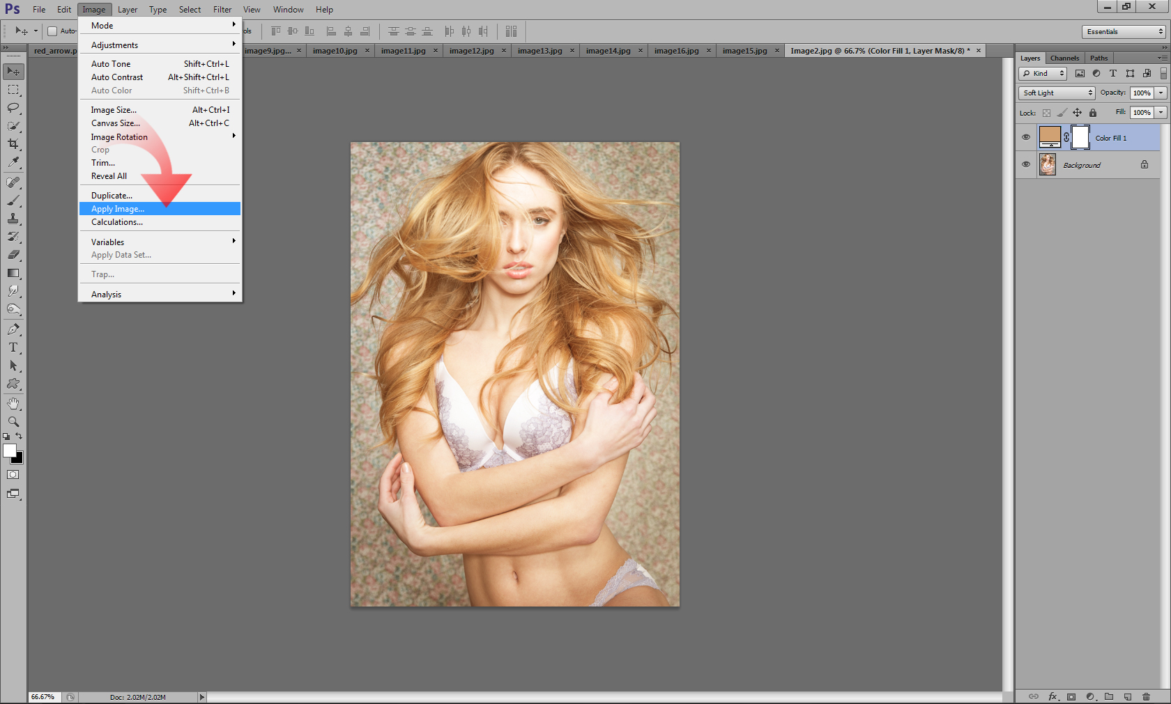
When the Apply Image window pops up you will see in the preview that a mask is generated. This mask automatically isolates our highlights and is exactly what we need for our purposes. So we will go ahead and click OK to apply the mask to our image:
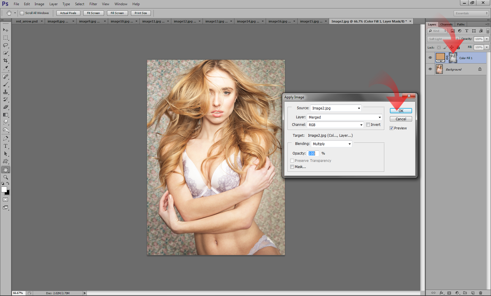
Once you have applied the mask, your solid color layer will only affect the highlights portion as determined by the mask. For the time being we will turn the visibility of this layer off:
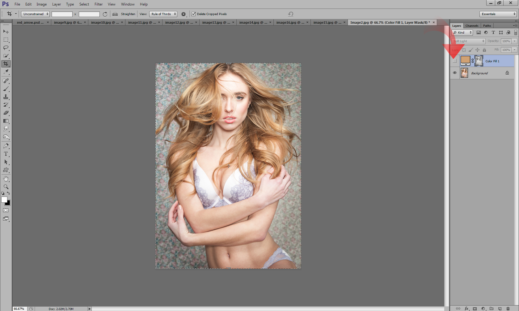
Now that we have the highlights portion pretty much completed, we will repeat the process, but this time with a few tweaks for the shadows portion of our image:
Again, we will create a solid color layer, but this time we will sample for our shadows. We used the yellow from the hair as a sample for our highlights, and now we want the purple/red from the floral print to be our sample for our shadows. So we will go ahead with the eye dropper tool and select something from the color range we want by sampling the background:
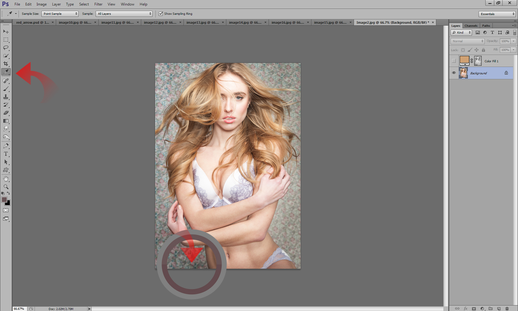
Once we have our color sample selected, we can go ahead and create the solid color layer as before:
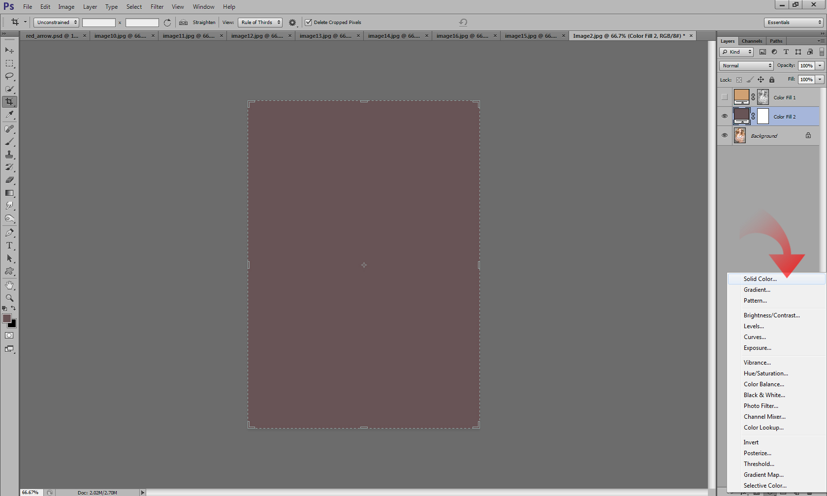
Again, the solid color layer is going to need a Blend Mode, so we can select one as we see fit. I recommend soft light again for the gradual transitions:
Since the application of this solid color layer is yet again Global, we need to isolate it strictly to the shadows, since that is what we were hoping to affect. With your mask selected we will do this through the Apply Image function, so go into the Image Menu, and select the Apply Image option:
This time our settings will be a little bit different. As you can see, a mask is generated, but it is by default going to affect our highlights. Just off to the side you will find an “Invert” check box. If you check that box, your mask will be inverted, thus affecting your shadows. So let’s go ahead and do that, and click OK to apply that mask:
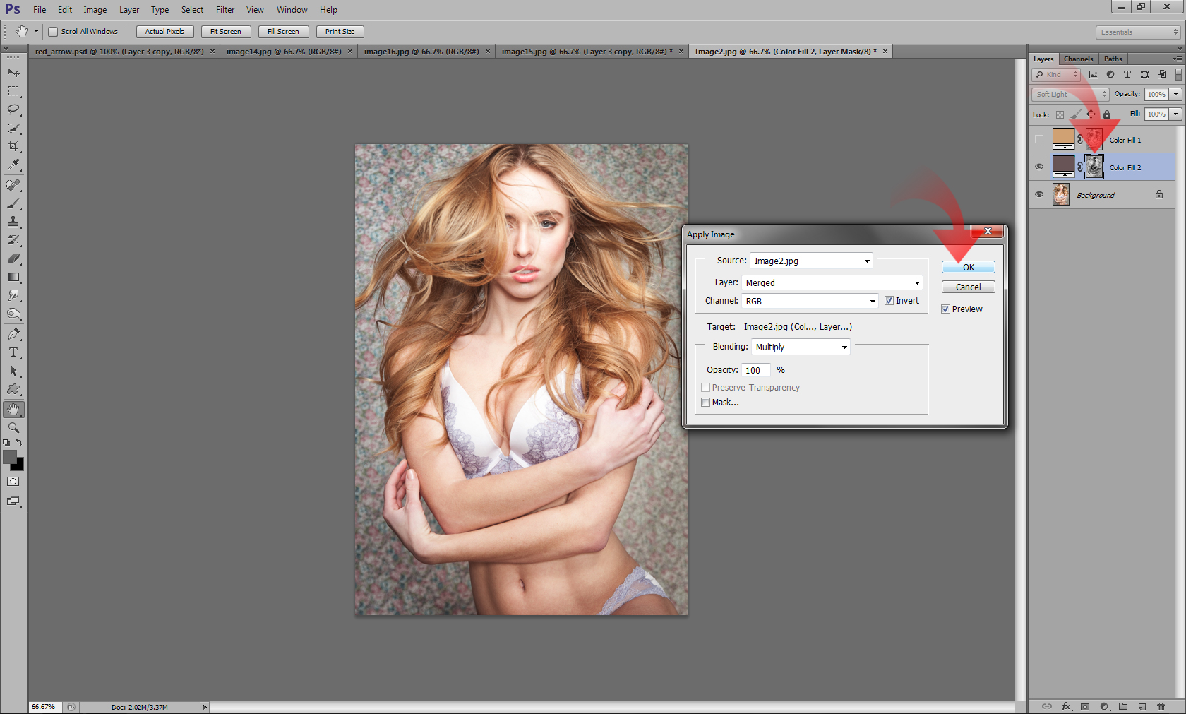
At this point we will have two solid color layers. We can go ahead and turn the visibility back on for the highlights layer:
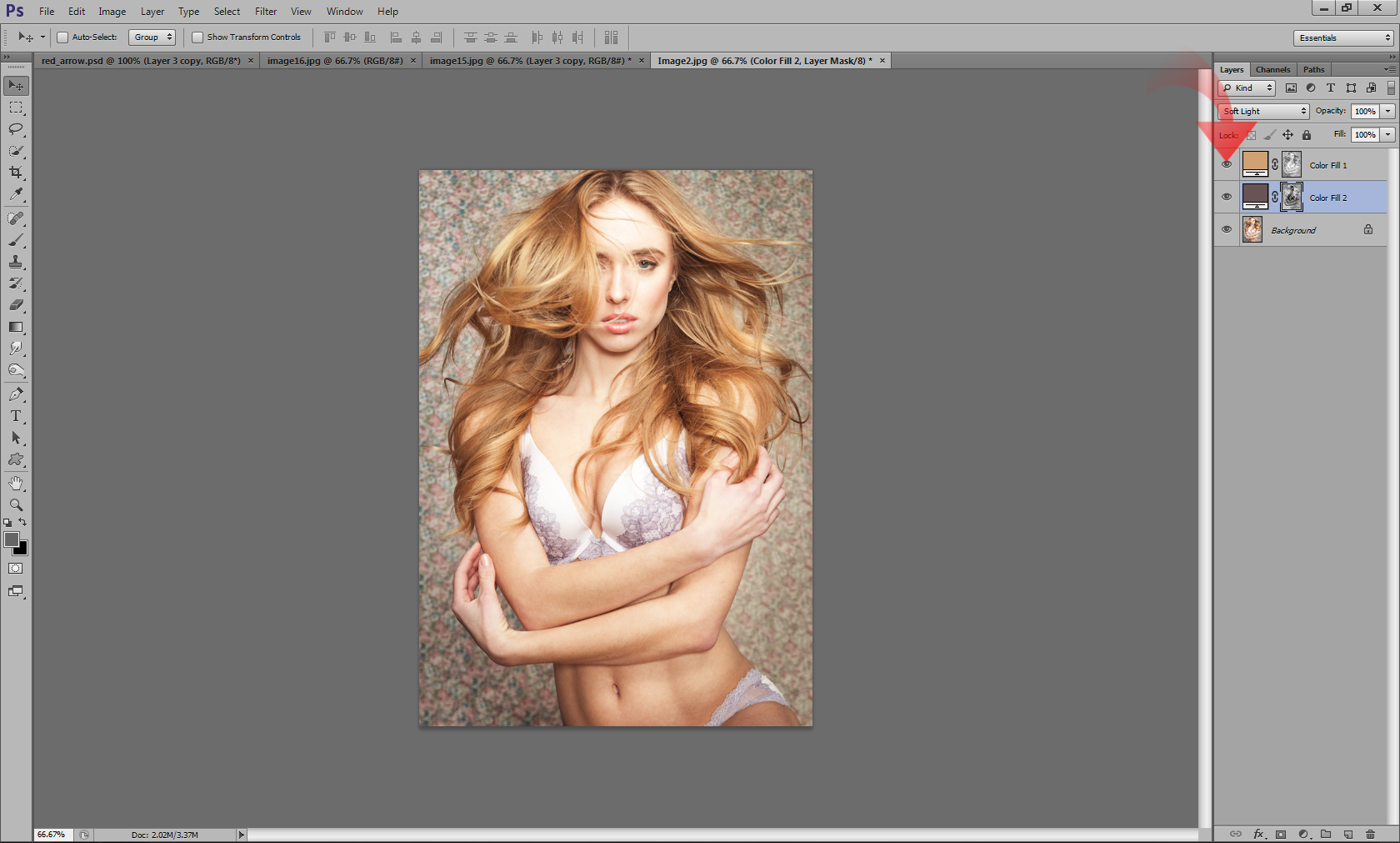
The image might look a tad off right now, but adjusting the Opacity of both the Shadow and Highlight layers will give you the control you need to dial in the balance just right:
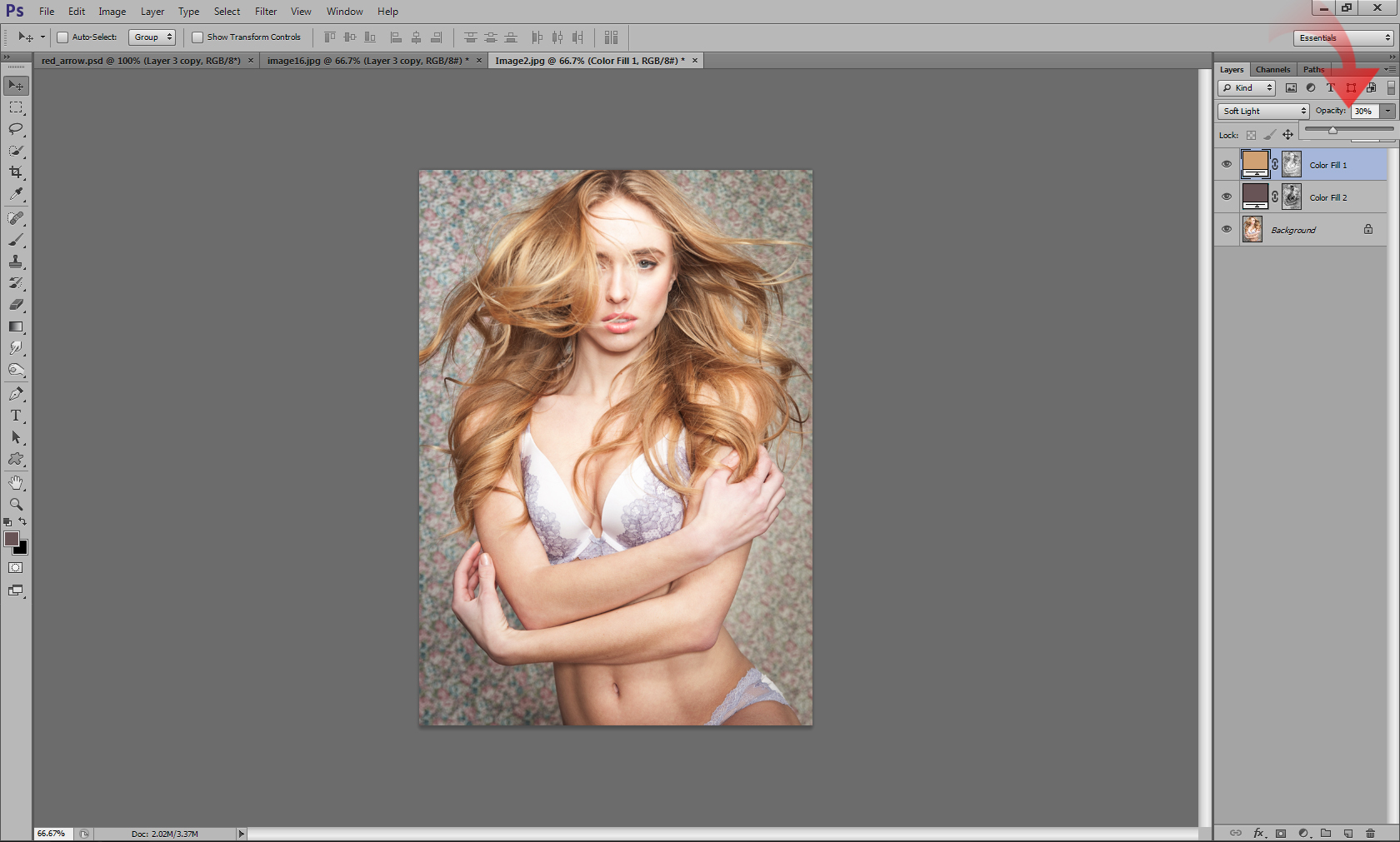
Once you dial in your opacity just the way you like it for your image you will have a final color graded image like so:
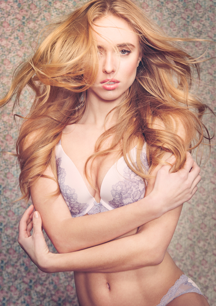
The nice thing about this method is that once you are done adjusting your opacities you can also go back in and change the hue of your colors at any point. The colors you select initially are not a concrete selection, but rather a template upon which to build. It is a method for you to give your images a more unified look but there is quite a bit of room to modify your selections which makes it very versatile. It makes for a great starting point especially when you are unsure of the direction in which to take your image.
Feel free to share your samples using this method in the comments section! I look forward to seeing some results.
